I am a stalwart but cranky fan of FotoFocus. Since its beginnings in 2012, I have seen a fair number of the exhibitions connected to it and have written about a modest number of them as well. I have defended it against people considerably more cranky about it than I am. I have argued for the centrality of photography to modernism and post-modernism, for FotoFocus’s role as one of the most significant, ongoing art events in Cincinnati, and for the potential pleasures of seeing interrelated shows at venues across the greater metropolitan area. On the other hand, even its fervent allies must confess that FotoFocus has issues. Some are about scale. Are the central shows big enough? Have the main venues used FotoFocus as the pretext for a head-turning, game-changing blockbuster (whatever we take that weary term to mean)? Are there too many small shows, some of which seem half-hearted and distant from the missions of these galleries and institutions? And then there’s the question of the vagueness and vapidity of the biennial’s themes (this year, “World Record”), resulting in shows that only seem to be in conversation with each other by acts of extreme critical dexterity, and therefore create no synergies.
But sometimes quiet shows run deep. Kent Krugh (in collaboration with Cathy Mayhugh, Director of Exhibitions) has curated two shows for FotoFocus at Hamilton’s Fitton Center for Creative Arts, one roughly about portraits and one roughly about landscapes, that are each gems, and that create some synergies between them. Though works related to the genres of either show could potentially have filled a whole floor of a respectable art museum, they are both small but incisively curated, suggestive of larger issues in photography and our culture in general. And despite their size, both manage to offer enough exposure to each artist’s skills and ideas so that the viewer can draw some conclusions about what they’re up to. It is fair to say that Krugh is drawn to works of lyrical intensity that are frequently in purposeful conversation with the techniques, esthetics, and issues of photography’s previous hundred years. As you walk through the shows, you can see daguerreotypes come to life, you can experience new uses for cyanotypes, tintypes, and photogravures, and enjoy the curator’s choice of works allied to pictorialism, the sort of 19th century painterly image-making that photographic modernism had hoped it had killed off forever.
In “Unusual Characters,” Craig Barber shows wonderful pictures from a series he calls “Working the Land” which connects very strongly to a 19th century tradition of photographing people and their labors. (Think about how hard today’s professional photographic portraiture works to excise all traces of our day jobs.) Barber’s photographs ask us to consider to what extent people are what they do. His subjects are portrayed via tintypes, a long-gone medium somewhere between daguerreotypes and roll film. In “Cody Washing Potatoes” (2013), Cody is a rangy young man, looking up at us while washing spraying water on a few handfuls of taters at an outdoor wooden bench. At his feet is a box full of his glistening products. He looks up at us without stopping his work. Have we interrupted him? Are we dragging him away from what he does (or loves?) or is he pleased to break his absorption for a moment? There is something resistant about him, something counter-cultural, if for no other reason than that his work is a reminder of a past, of a time, as Baber notes, “when we were all closer to the land.” Is his costume—loose shirt, loose pants, watch cap–designed to be hippy-ish, or have hippies always sought to look like Cody?
For that matter, what exactly do we know about Cody? I am not questioning either Barber’s or Cody’s seriousness of purpose. But it is useful to remember that many photographs make us think we know something about their subjects and their worlds; we could equally be reminded that pictures can fool us into thinking we know more than we do. Cody could as easily be an actor as a farmer. We may hope to think we understand him, but we can’t be certain, any more than we can be certain about our various romances about land-based eco-culture.
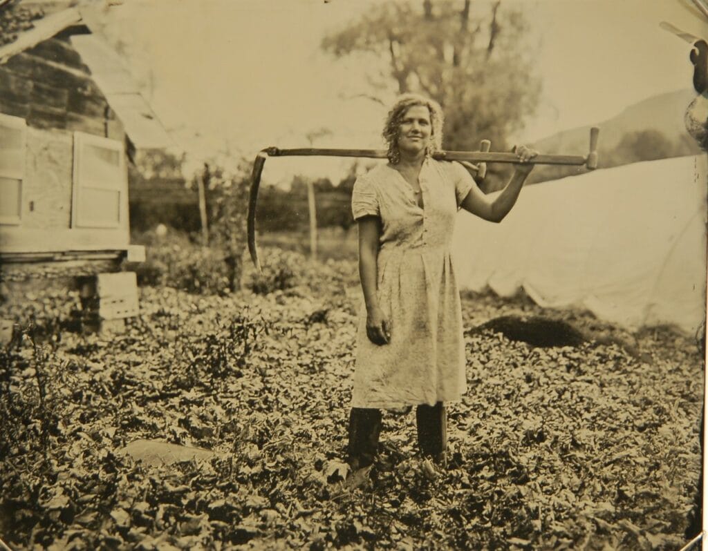
There is also something resistant in “Eric Plowing with Horses” (2011) whose subject looks back over his shoulder at us, scowling. By contrast, “Aileah with Scythe” (2014) is agreeable and seems happy in her work. She is statuesque, up to her shins in greenery, and bears a smile on her face. That smile is complicated at least a little by her top being unbuttoned just a little more than is purely practical. But whatever Aileah might inspire us to be thinking is in turn complicated by the seriousness of the scythe she carries. I take this to be part of Barber’s—and Krugh’s—approach to portraiture: we should be open to the complexity of what we see, and yet still retain at least a little skepticism about what we think we know.
Sunjoo Lee captures her subjects in unremarkable, if slightly stiff, poses. They are all female, and all wearing a little black dress, which tends to merge with the deeply black backgrounds. What is most striking is that wherever we might expect to see skin, we see only collages of wrapping paper, which Lee calls, intriguingly, a “sacred item.” They are not gift-wrapped, but covered with hundreds of tiny pieces of various papers, like a colorful mosaic in human form. We can be sure—but barely—that they are human, rather than mannequins, because we see their hair, their fingertips, and their lipstick-covered mouths. Lee proposes that her “concept of ‘wrapping’ doesn’t come from a place of suppression or veiling of someone’s true identity. It comes from a place of expanding the realm of opportunities….” That is an explanation worth taking into account, though it is tricky: wrapping paper can’t help but call to mind the nearly infinite proliferation of images in our culture, a world of decorative surfaces for possibly commercial purposes, and the quickly disposable nature of gift wrap. And while it sounds like she wants to argue that these images are not about gender issues, it is also plainly true that all her subjects are female. While their worlds may be filled with infinite possibilities in the future, they have had to sacrifice their identities now.
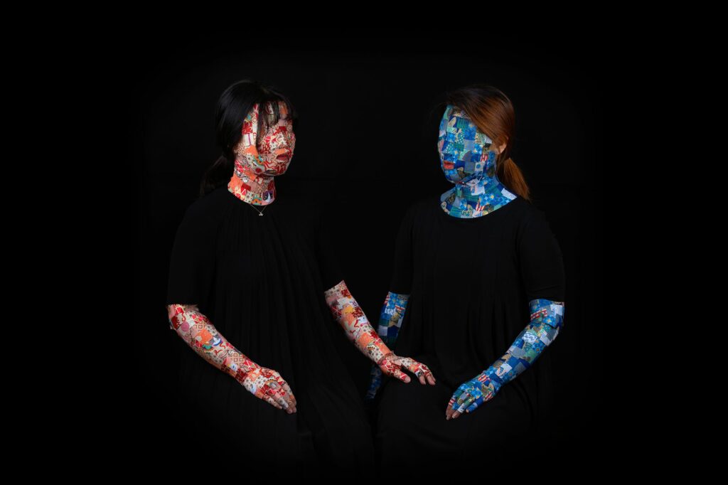
Are they wholly impersonal? They hold props—a book, a flower–but that could go either way, affirming their individuality or suggesting that they exist to express a familiar, recognizable symbolic meaning, like a medieval Madonna holding a pomegranate. Insofar as there is something creepy here, it would certainly include that it is not just their arms that are papered over, but their eyes. They can be seen, but cannot see. “Jacqueline” (2017), for example, holds a book but cannot read it. “Elizabeth” (2017) gesticulates in our direction but cannot see us—nor we, really, her. “Laura & Rosalynn” (2017) is like a masterful Renaissance double portrait, with two women in each other’s company, not quite interacting but with one touching the knee of the other. They are not interchangeable—they have different hair color and the colorways of their wrapping paper are distinctive—but they seem equally placid. Lee’s subjects seem to have accepted their situations with serenity. The most intensely human thing about these subjects is not quite visible, but is everywhere implied—the extraordinary patience with which Lee’s subject allowed themselves to be mummified. Can we keep ourselves from wondering how they felt when they were blindfolded?
I do not think that her subjects are being mocked, but that the purpose of these works is to raise questions about our expectations—perhaps even our demands—about portraiture. What do we want to see? How will we respond to not seeing it? There is something potentially colonizing about the portraitist’s gaze. What does that make us? I think that portraiture traditionally is partly about the audience’s fantasy that they own, or can borrow—if only for a moment or two—someone else’s identity. Lee won’t gratify that desire. Lee’s subjects retain their identities—that which is wrapped can also be unwrapped—and they will shortly return to what they were. We find ourselves in the complex position of the artist who has done the wrapping, a concealer rather than a revealer.
Not everything in Krugh’s show is meta. But even work that is more or less transparent and less technologically complex, such as Matt Zory’s street photographs from his series “The Other Side of Music Hall,” raises questions about what sort of transaction we think goes on in portraiture. Some of Zory’s subjects are less extravagant than others, but none of them exactly shows off a modest self-presentation. In “Sunday, Waiting for the Church Van, 12th St. Near Elm” (2014), a Black man tilts his head to smile at the photographer. Wearing a black raincoat over a dark suit, he leans to put his weight on a crutch. “John, Race St. near 12th” (2015) looks towards the viewer less ingratiatingly. He is a younger man whose undershirt barely conceals his tattoos and his impressive physique. Zory’s subjects collaborate with the photographer on a fantasy more or less of their own choosing. Zory, a former Assistant Principal Bass player with the Cincinnati Symphony, has documented the renovation of Symphony Hall from the inside. But what exactly is “The Other Side”? He clearly wants to highlight that he is focusing on people from the neighborhoods surrounding Symphony Hall. But if what goes on inside Symphony Hall is that an audience watches players perform, how different is that from what happens on “The Other Side”?
Claudia Kunin is represented by “Five Spooky Tales in 3-D” (2018) where the artist has animated (by means of what feels like countless hours of work) the figures in mid-19th century daguerreotypes to suggest some powerful issues about the seer and the seen in portraiture. (I will have nothing to say about the 3-D elements and apparatus; I do not see what the adding of modest depth contributes to works that are perfectly powerful and unsettling without it.) By animating a hundred and fifty year old images, the dead are brought back to life—hence the title “Spooky Tales.” These ghost stories have something in common with the cautionary fictions of “The Monkey’s Paw” or Stephen King’s Pet Sematary, where the granting of our desires, however well-intentioned, reveals the flaws in desire itself.
“Precious” starts with a reminder of what sort of image a daguerreotype is: a private token that can be seen by only one person at a time, and that is contained in its own case, unseen unless the owner of the image opens it. “Precious” begins with the slow opening of its case, like a door to a crypt, revealing the portrait of a young woman. As we look at her and she looks at us, she speaks! “I’ve been waiting for you.” And what does she do now that we are there? In a languorous way, she floats free of the frame and disappears. We have helped set her free, clearly, but it is not clear at all what will become of her freedom. Will she haunt us? Or will she enjoy her freedom merely by not being captive to our gaze?
It serves as a reminder that ghost stories are empowered by the appetites of their audiences. If we didn’t want to be spooked, we could always walk away. In “Monsieur L’Amour,” a modestly handsome young man stands in front of a white house. Throughout this tale, he does nothing. This animation is all about us, as we explore the world in which the daguerreotype’s young man dwells. As we stare at him, he dematerializes, and Kunin has us slowly approaching the white house’s front door. It opens before us, and as we enter a rather large room, we walk towards one wall on which is hanging…the portrait of Monsieur L’Amour, in front of a white house. As we look at it, his picture starts to loom larger and then to dematerialize. Blackout. I take this as a reminder that our looking at him contributes to our haunting of ourselves.
“Sad Mother” is in some ways the simplest and the most powerful of the five animations. A woman wearing black holds a baby in her arms. If we know anything about the long exposure times necessary for a daguerreotype, it’s that the only babies we will see in them are dead ones. The mother looks up at us, reaches out, and slowly pulls a dark curtain in front of her. It is hard not to be touched by the photograph that is reluctant to be seen. We may own the image, but at its core, the image wants its privacy. A portrait is about our claims of ownership, but the intensity of the person being portrayed may want above all to express her own autonomy, and not be seen.
The Fitton Center’s second exhibition is more elusively titled “The Land & That Which Lives On It.” It is a more sprawling show, with more artists and more ideas to juggle, an ongoing reminder of how hard it is to say just what we mean by “nature” these days. The question raised by this ambitious collection of work is: What will we need to be able to see and appreciate the otherness of the world around us?
Catherine Aboumrad’s work suggests that we chiefly need patience. She goes to places in the Canadian wilderness distant from all human settlements. She takes her pictures with very long exposures which allow the works to lose their roots in time. In an “Untitled” work from her series “Capturing Stillness” (2009), we see a low, dark horizon line and a magnificent green glow. It might be an aurora, but I doubt it: I think it is a lighting effect caused by the length of the exposure, which we can tell by the fine lines that are the streaks of the stars as the earth moves grandly under them. It transforms the emptiness of the sky into something as material as a dense fog. Her work fully appreciates the power of the sublime. There is a thin line between form and formlessness as the enormity of nature overwhelms us.
This, says the artist, is the landscape “without intervention,” but there is very little else in the show that is utterly free from intervention. Christa Blackwood’s work shows how well she understands the appetite—both aesthetic and commercial—for the conventionally beautiful landscape. In the works from her “dot red” series that are on display, she exquisitely recaptures the American photographer’s love of western vistas, from Carleton Watkins to William Clift. Her pictures are printed in sepia tints as photogravures, as if they came from some rare portfolio produced by frontier artists for the pleasure and wonder of a wealthy eastern audience. “Santa Elena”—presumably taken in the Texas canyon—locates the viewer at the water level with the canyon walls towering above us, in line with many of the earliest 19th century visions of the lands beyond the Great Plains. But like each print in the series, there is a transparent red dot, rude and rogue, perhaps the size of a silver dollar, which serves as a distraction and possibly even a disfigurement of the scene. It is certainly an interruption of any chance that we would allow the landscape to carry us away, the post-modern registering its objection to the romantic. Elsewhere, Blackwood has identified the red dot as a specifically female interjection to the predominantly male view and invention of American landscape conventions; on her website, she calls this series “Naked Lady: A Dot Red.” Among other arguments, part of her purpose is to remind us that even in untouched landscapes, we bring sensibilities shaped by social constructions.
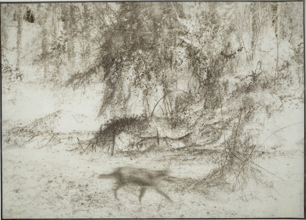
Post-modern interventions are even stronger in Alyssa Saloman’s works from her project “Animal Land” (2017). These are strange and haunting works of what the artist strikingly calls “feral beauty.” They are rooted in her collaboration with scientists and naturalists near where she was living in Virginia. The images have their basis in the distinctly artless images captured by trail cameras, which automatically secure images of animals that cross a certain path at night. They are then printed in negative and heavily manipulated so as to suggest that while we sleep, the world is overrun by the wild and the strange who appear as fleeting blurs. Everything appears as if it is being seen out of the corner of our eye. The close cooperation with science has rendered things practically unrecognizable, but has produced what Saloman calls “the Romantic sublime, that sensual experience of natural beauty intensified by awe and dread.”
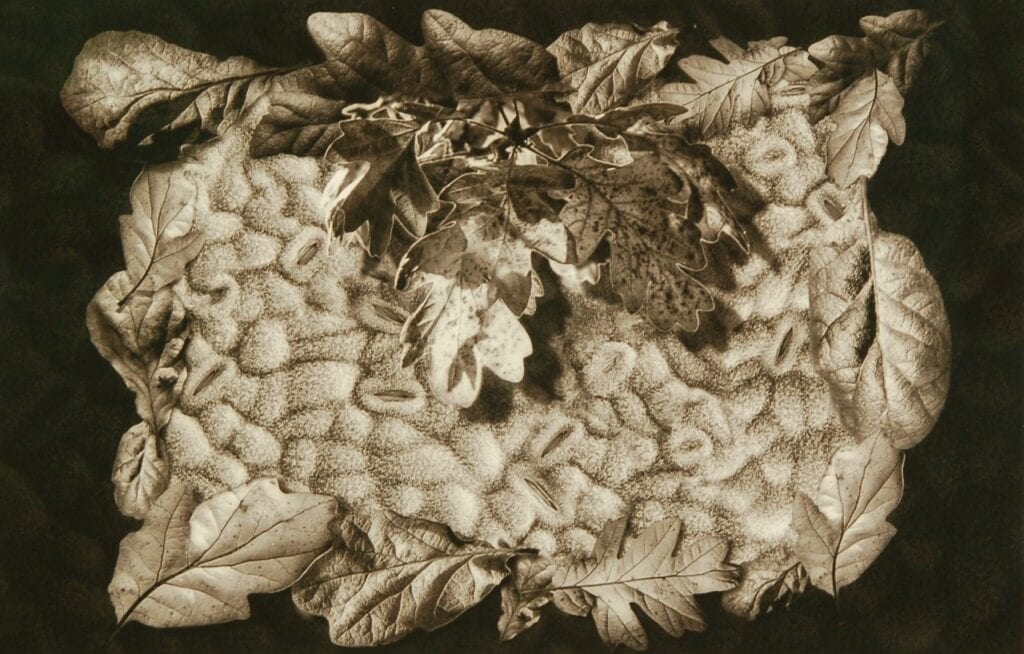
The role of science in the development of photography is a rich and complex subject, but it was typically engaged in what might be called a rationalist enterprise–trying to make the wonders of nature available to broader audiences, for whom seeing was believing. Robert Dash’s micrographs sometimes make him seem like a Victorian cataloguer. “Mosquito, Fruit Fly, Wasp” (2017) shows three different types of wings, and suggest that one value to the scientific eye is its clear objectivity. But in a work like “Garry Oak Stomata” (2017)–stomata are the underparts of a leaf that control gas exchange—we have a vision of nature that is both lovely and awful. The stomata are ghastly–breathing and hair-encircled mouths (rather like our own). A wreath of full-sized oak leaves surround the magnified cells, all in all like a crafts project that might be hung on a front door in an artsy neighborhood. It is brightly lit, perhaps to suggest the all-seeing eye of knowledge, suspended over a rich black background, which gives it some of its gothic frisson.
The section on “The Land” is to some degree dominated by a video by Kemachat Sirichanvimol called “The Anthropocene Epoch,” which is projected onto a screen in the middle of a room surrounded by the work of other artists in the show. A puzzling and beguiling piece, the video sometimes seems to be a scan of still images and sometimes taken by photographic drone. It is often hard to tell whether anything we are looking at is moving or just our point of view. Though the screen is filled with images of how mankind has come to dominate and reshape the landscape, we are constantly being asked to consider the possibility that these human interventions have created beauty along the way as well. There is elegance to a horizon filled with the slowly circling blades of windmills. What about the overgrown, graffiti-marked highways of the deserted town of Centralia, Pennsylvania, which had to be evacuated because of an underground coal fire that has burned on for half a century? What about the fine, filigreed lines of contaminated watersheds? How far will we go?
There is an uncanny element throughout the video in that man’s works are everywhere visible, but humans are not (aside from a tug making its way upriver and the occasional car). Sirichanvimol himself treads an interesting line. His own online portfolio shows him to be an abettor and purveyor of the anthropocene, with his extensive work as a fashion and “lifestyle” photographer, but elsewhere, for example, sharply noting that Ansel Adams’s romanticization of the west led to its commodification. The video is an important and arresting piece, with the artist perhaps asking himself as well as us whether sufficient distance can make anything seem lovely.
One of the filters through which we make sense of what we see is the sheer history of the medium. Krugh’s interest, in both shows, in older photographic techniques helps to give form to his selection of works. Tim Freeman works in gum bichromate printing, a labor-intensive layering of chemicals that is almost as old as photography itself. The layers give a wonderful richness and depth at the cost of the sharpness and crispness of focus that more modern technologies afforded. The reduced palette could cut both ways; I see it as a strong advantage to the form. It is almost inevitable that the genial blur of the image will make it seem like the work of the pictorialists, another kind of earlier aesthetic that Krugh seems to have been looking for. Pictorialism got a bad name because early 20th century photographers rejected its apparent reliance on the strategies, techniques, and visual architecture of painting; Krugh, in part, is looking for artists who take the old techniques and ideas and can make them new. Freeman produces magnificent pictures of Prince William Sound with a palette restricted to blue-gray. It is a picture that might have been made a hundred and fifty years ago. One wonders if part of the newness that Freeman adds is simply by its title: Prince William Sound is, of course, the place where the Exxon Valdez ran aground in 1989, which must surely play off against the purity of the water which reflects the sky in a blurred and lovely form.
My favorites of the Freeman pictures are in some ways even more old-fashioned—the two images entitled “Original Sin No. 2” and “Original Sin No. 4” (2015). I couldn’t swear that I know just why they’ve been given such resonant titles, but I think it goes back to mankind’s very first imposition upon the landscape: if it weren’t for original sin, we would still live in Eden and it would be eternal spring. With that sin, humans brought death, and work, and the seasons. So in “Original Sin No. 2,” we have a subdued but beautiful fall scene with a bare tree arching over and reflected in a body of water, set against a backdrop of yellowed leaves. It’s achingly calm and beautiful, but Freeman wants to use the title to call attention to the distant past (perhaps as he did with the pictures of Prince William Sound). Because of that human intervention, we’ve had to adjust to and learn to accept a different sort of beauty. “Original Sin No. 4” takes us even closer to our culture’s theological roots, portraying a decaying piece of fruit, an apple I suppose, still clinging to its branch. There is nothing appetizing about it: the fruit is kind of dirty, its inside has turned to mush, and skin around it is collapsing in two large dimples, about the size of the marks fingers might have left behind in grabbing it. And yet it is also plainly lovely, even if it is more orange than red. I like it in part because it reminds us that fruit isn’t born in plastic wrappers that encase them in supermarkets, but they are, and must be, in harmony with the natural world from which we pluck them.
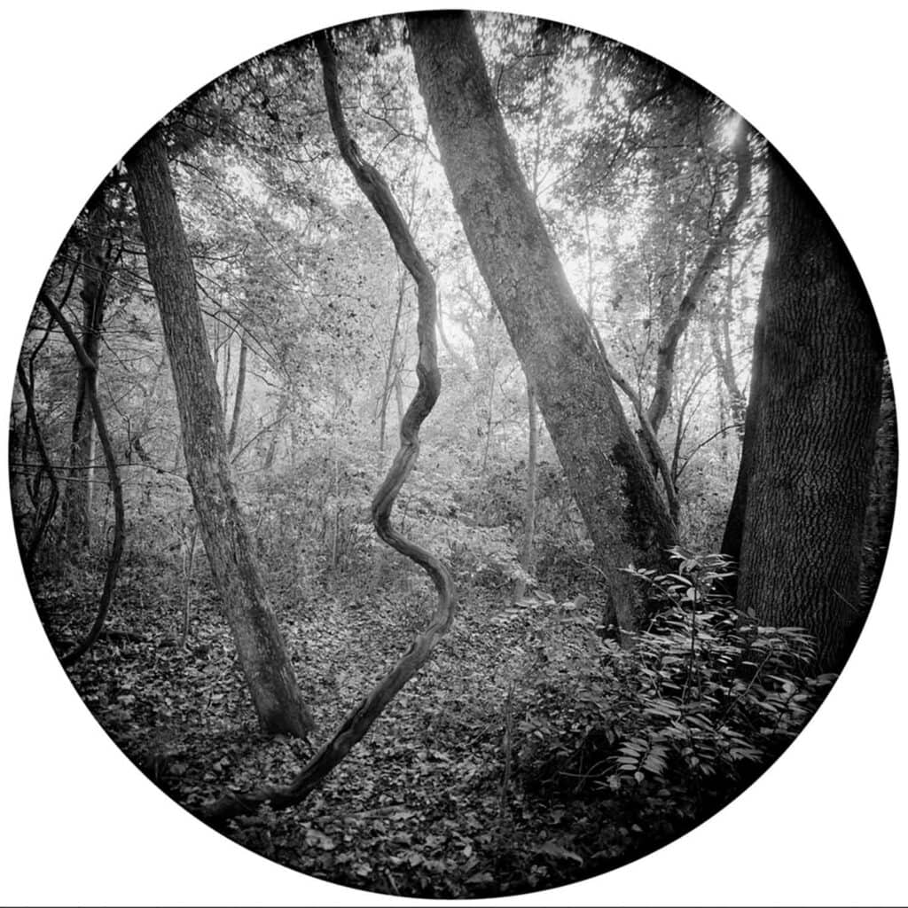
Susan Patrice’s work is, like Freeman’s, also caught up in historical and spiritual responses to our world. She explains in her Artist’s Statement that her photography is a response to “questions of place, belonging, and multi-generational trauma,” both personal and historical. Her works in this show are all circular, and she has explained elsewhere that she wanted to get away from the tyranny of lines and angles. With the new shape, she also can shed the dominance of a horizon line, and envelope us in a more all-over sort of composition, one that certainly reads edge to edge. In “Enveloping Landscape #10” (2018), the background of dark, angular trees is softened by the swirls and rings of dried vines in the foreground. In “Enveloping Landscape #1” (2017), the slanted trees are in conversation with a twisted grapevine that seems to be defying gravity. Patrice is able to see new possibilities in landscape by looking for new shapes. She is also, I think, in some part going back to an earlier vision of the landscape, one that valued the luxuriance of undergrowth even if it constricted the possibilities of more tightly constricted geometries. Her photographs remind me of pictures taken of Civil War battlefields not long after the war: it is striking how quickly nature moves in, with histories of its own and a healing impositions of new shapes, to cover up the passions and oppositions of humans.
The most moving of the pieces in “The Land” part of the shows at the Litton, and perhaps the most moving thing in the exhibition as a whole, is Anne Berry’s work from her series “Behind Glass.” Frequenting smaller European zoos, she has taken pictures of monkeys and apes as they are to be found in their new, human-designed habitats. These are not the sorts of habitats that win prizes, but generally old-fashioned ones. Each primate is shown behind glass, which keeps them in and keeps us out. Berry’s photographs are designed to challenge the effects of that glass, suggesting ways that we are alike on both sides of the cage—alike enough that we can read the characters and expressions of the animals. I would hate to meet the person who was not moved at all by these efforts.
The animals are identified by the names given to them by, well, by whatever process zoos bestow names upon animals, rather than by their species or original locales. They are “Louis,” “Andrei,” “Charly,” even “Persephone.” And just as humans name them, they project identities upon them. (Standing in the midst of a crowd at a zoo can be a very discouraging activity.) To a degree, these photographs risk encouraging that. This one looks like a teenager who got caught doing something; that one seems to be in despair. Some of what we see as communication between animals and ourselves is pure projection; it can be hard enough to reasonably understand our domesticated animal companions, let alone formerly wild animals that we see for only a few minutes when they are caged up. Berry is willing to take the risk. She has said that “it is clear that they are posing for my camera and that there exists a human-primate bond.” As much as I like these pictures, I would not have said that it was “clear” what the animals’ perspective on the whole venture was. It is much more clear what Berry thinks she is doing and achieving. We are back, in a way, to the issue of otherness and the puzzle of shared assumptions that we had in Craig Barber’s tintypes of people working the land. I would have liked to see what Berry’s photographs would have looked and felt like if they had been in the portrait show rather than the nature show.
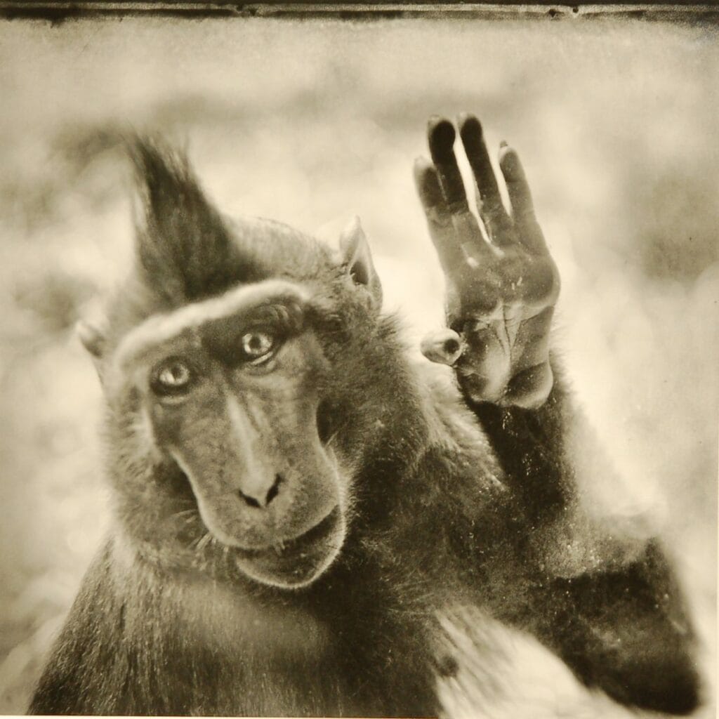
And yet these are extraordinary photographs. “Louis” (2011) is raising his hand towards us, leaning on the window between us. Is he saying “hi” or “bye” or just hoping to get any sort of recognition back? (Or is he perhaps just leaning on the glass because he has lost his balance?) It’s a tricky thing, this otherness. “Boma” (2014) seems both wise and resigned. I believe he is signing towards the camera, but I do not know what the sign signifies. Does he still hope that someone will pay attention to what he has to “say”? Is all communication between humans and animals like a gorilla signing in the direction of someone who does not know what the signs mean?
Part of animals’ gifts to us is that they permit us to project identities, motivations, and whole personalities onto them. It is a short step from that to mere colonialism, but perhaps humans cannot help but project themselves onto the worlds around them. We do it with the landscape; we do it with portraits; perhaps it is behind our every effort. We do not know what animals see when they look at us; we barely know what our spouses see when they look at us. But if a photograph can never really create a genuine intimacy, it can at least recognize the distance between subject, artist, and audience, and use all the tools at its disposal to honor what is and isn’t there.
Fitton Center for Creative Arts, Hamilton, Ohio
October 8, 2022-January 6, 2023