Upon her death in 2019, art supporter and collector Alice Weston bequeathed 49 artworks from her and her husband’s collection to the Cincinnati Art Museum. (In 1994, the Westons had made a previous significant donation of over a hundred works.) About a third of their newest gift is on display in a gallery on the Museum’s first floor; sooner or later, we may come to see other works from the bequest by such artists as Christo, Dubuffet, de Kooning, and Jim Dine, among others. The Westons had become interested in acquiring art as early as the 1950s, but major works by the Abstract Expressionists were already beyond their budget—and their collecting was governed by their disposable income, as is true of all collectors. They were able to get some shrewd help in shaping their buying of art from gallerist Carl Solway and CAC Director Jack Boulton, and ended up with some extraordinary things.
One thing that might strike you right away when you enter the gallery is that the works are small. The move towards monumentality is one of the many stories of American art in the mid to late 20th century, and this gathering of artworks cannot capture that. (Imagine how the Weston’s Andy Warhol painting of a single soup can would look if hung right next to the much larger “Pete Rose” upstairs.) The wall tag concedes this right away, noting that the works present themselves in a more “intimate scale.” I will admit that at first I was put off by this, but I came to value it. This is art that can be—and was—lived with, and that too is a significant condition of art. It is hard to imagine many large works of contemporary art in our homes; they are designed for the walls of a museum. The Weston Collection consists of works that you can, and should, get close to (if the Museum guards permitted it). Each one would require only one person to hang it.
Making up for the loss of scale is the confident eye of the collectors and their advisors. By and large, they committed to artists and art movements early. They tended to be attracted to work that has the feeling of a breakthrough just barely around the corner. Generally, the more ripe the artist’s career (and the school they belong to), the less exciting the work, such as a Man Ray multiple, a wall sculpture conceived in 1958 and executed in 1973. I think that one quality of the Westons’ taste was that they saw that the art that followed Abstract Expressionism was less personal. They responded by finding work that might be caught up in the tools of the impersonal but then pushed that towards the human, the humane, the thing that is differentiated and individual. Over and over, their collection contains things that could be flat and minimalist, but in time, reveal instead depths that are often pictorial, philosophical, and even spiritual. Flashy autobiography is avoided but so is the cold and the distant.
The works of the Weston collection encourage a rethinking of the issues, ambitions, and achievements of Pop Art, which is in itself a serious accomplishment. The exhibit’s“Fork” by Robert Indiana (1962) is part of a series he did that included both small versions and full-sized ones. (Thank heavens it is not part of the mind-numbing LOVE series.) The painting is divided in half, with a fork as seen from above on the bottom half and the word “FORK” painted on the upper half in a stencil font. It is an extension of a still-larger series of “EAT” paintings, of which Indiana has said—I think unconvincingly—that “the happiest moments of my childhood…were these big family reunions…where eating was the most important thing.”
I do not think that the puzzle that is Pop Art will be resolved by making it highly biographical and sentimental. It seems much more significant to connect “Fork” with Magritte’s famous 1929 work “La Trahison des Images” (The Treachery of Images) where he painted a pipe and wrote in careful script beneath it “Ceci n’est pas une pipe”—this is not a pipe. Of course not. It is a picture of a pipe, which should lead one to think about just what is and isn’t the power of an image. So too with Indiana’s painting. Neither the clinical label “FORK” nor the painting below it, after all, is a fork. (Indiana would come to play with this concept later in the series when he would paint merely “FOR” in the top half, knowing—among other things—that the viewer would automatically complete the word. Is “FOR” any less of a fork than “FORK”?) As Indiana said of his EAT works, more mischievously, “it is a sign you see on every road as you leave the big towns, and signs are important to me.” Indeed.
One of the central ventures of Pop Art was to explore to an extreme modernism’s investigations of the mechanicalization and depersonalization of culture. Indiana’s painting could be a melding of the information needed on a shipping container of generic forks with the colorful appeal of a box selling them retail. But when closely examined, the painting itself reveals the artist’s autograph touch. That is, the lines are not completely smooth or straight, and the brush has not filled in all the spaces. At this relatively early stage of his career, at least, Indiana lets us see the hand-painted nature of both the fork and the lettering. It is a reminder of how the machine has not taken the hand gesture completely out of art.
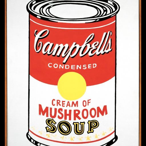
We see a similar thing even more strikingly in Warhol’s “Soup Can (Cream of Mushroom”). It was painted in 1962, the same year of Warhol’s first gallery exhibit, which featured soup cans, each done in the same size as the Westons’ canvas. As was the case with Indiana, critics pressed Warhol to personalize his connection to his subject matter, and he, of course, obliged: “I used to drink it. I used to have the same lunch every day, for 20 years, I guess, the same thing over and over again.” To ask someone like Andy Warhol about intention is to invite him to parody it, though he does provide that far more interesting clue about his interest in repetition. In 1962, Warhol was working on his Campbell soup cans, as well as his first versions of Marilyn, Elvis, and Liz—celebrities all. Soon, he would make the transition to silk screening on canvas to make his imagery more uniform. But not yet. In the Westons’ version, even more than with the Indiana “Fork,” we can see how the picture has been hand-done. A close look will even see the pencil drawing beneath the paint. For me, this brought Warhol’s work back into the realm of painting rather than icon, and reminded me that his soup cans were in a long line of modernism’s fascination with how a three-dimensional reality could be rendered in a flat, two-dimensional work on canvas.
In addition to his nearly endless sequences of lipsticks, cigarette smoke, and Great American Nudes, Tom Wesselmann had a career-long interest in still life. Though Wesselmann took care to distance himself from other Pop artists, he shares with them an invocation of banal objects to raise questions about what is “real” and why we need it to be that way. He did many pieces similar to the Westons’ “Great American Still Life #6” (1962), some much larger, though they tend to share certain elements with the Westons’ piece: canned goods; a checkered pattern that evokes a tablecloth; some fruit; something alcoholic; and a small image of the greater world beyond—in this case, a photo of the Guggenheim Museum, which sits in an upper corner like the view of an upper-class estate seen out the window of a Renaissance portrait. It is often not quite clear in this piece just what we’re looking at. The apple seems painted while other elements are clearly collaged, but some could be either. Some things have gravity and could well be sitting on the tablecloth while others seem to float. His still lifes do not pay homage to the great traditions of 17th century paintings of laden tables. The elements are sparse, unappetizing, and do not go well together or suggest a meal. They do not evoke a space, such as a dining room, or a time, such as a particular meal or its aftermath. I think Wesselmann is interested in the randomness of the things with which we surround ourselves and in blurring the line between sustenance and its representation. There is a second-hand quality to reality in these works; both the collaged tomato can and the painted apple are signs of food, not unlike the way that Indiana’s forks were signs of how we might eat.
Claes Oldenburg’s “Box of Shirts” (1964) was created just at the cusp of the time that he started to make over-sized pieces. (In the same year, he made a folded shirt the size of a bedspread.) He created the almost life-size “Box of Shirts” as he was moving out of the drama of happenings to the universe of imitations. In 1962, he had a show called “The Store” which contained his versions of what you might see on the shelves of some shop, except everything was made from plaster, each one obviously painted by hand. He was moving from the unscripted drama of happenings to the unspoken and seldom acknowledged theatricality of the way we as consumers ponder, admire, and select our objects of desire. Oldenburg affirmed the tangibility of things. There is a positively Whitmanesque tone to his embrace of the material world; he wrote in 1961: “I am for the white art of refrigerators and their muscular openings and closings.” Oldenburg is always happy to be messy, as he is with these shirts; where shadows might be, we have drips of dark paint. The shirts are puffy and not, of course, wearable. (Ceci n’est pas une chemise.) They spill out of their green wooden box which serves as a frame of sorts. The work was done just before Oldenburg would make everything—matchbooks, shuttlecocks, clothespins, hamburgers, ice cream cones, apple cores–enormous; he would go on to build his career on the premise that almost anything could be blown up in scale, made out of canvas, and filled with kapok or foam. Those works are both a little bit funny, a little bit awe-inspiring, and perhaps a little bit shame-inducing: why is my life filled with these things? The shirts may be dull, but they engage us. Maybe the thing I am shopping for is just one green box away.
Joseph Cornell, who belongs practically to no school, is another example of the teeming imagination of the mid-century artists to which the Westons were drawn, who rearrange the tangible world for us. The first Cornell to enter the museum’s collection, this work from “The Sun Series” (1957) has an small circular lithograph of a jolly old sun against the back wall, a rod with a large hoop going from end to end, a miniature wine glass sitting on a floor of tiny yellow pebbles that might be sand or ground corn, and a marble, looking like a globe. He framed his shadow boxes and put them behind glass in part to encourage us to see and appreciate space, both literally and metaphorically. Like a number of the Westons’ pieces, there is a touch of surrealism to it, reinforced in part by the sense that we are looking at things of very different scales brought close together. There is also a formal elegance to a work whose rectangular frame is filled with circles and spheres of varying sizes. Like a map, the small things in the assemblage suggest larger ones, and all of them suggest that the mysteries of the universe can be drawn into in a very small box. There are tiny nails, painted white, driven into the box’s floor and ceiling, perhaps suggesting a human need to fence things off or hold them together. The piece’s geometry is both elegant and slipshod. The sun is surrounded by a thin metal rim suggesting rays; another piece of the metal snakes around the wine glass. The calm of the piece is disrupted in part by the plaster—or thick paint—that surrounds the image of the sun and from which it seems to be bursting in a moment of frozen motion. It feels to me to be telling both an adorative and cautionary tale. Its world is both explosively new and ready to settle into an age-old melancholy.
The wall tag notes that the Westons were able to snag one Abstract Expressionist piece, an untitled work by Hans Hofmann. But Hofmann had a complex relationship to American abstraction. He painted his increasingly abstract works of the 1940s on Cape Cod, dragging his easel out over the dunes, working en plein air. Abstraction is what he saw when he looked around him and, accordingly, that is what he faithfully painted. In 1947, the year he completed “Untitled,” he met Jackson Pollock. Seeing his work, Albers asked him “Do you work from nature?” and Pollock is said to have responded, “I am nature.” There’s a world of difference there! From Hofmann’s other works of the same year, we can see stronger hints of landscape than we do in this work, where his interest in geometry—angles, diagonals, and shapes–seems much less connected to any terrain. The opaque brightly colored squares and rectangles that characterize Hofmann’s later work are starting to appear, though we can see reminiscences of the natural world in the painting’s squiggles and curves.
Hofmann’s squares are more entangled with excitement of paint being pushed around by the bristle end of the brush or scratched with the wooden end than are Josef Albers’s, who is represented by no less than three works. They are all from the Homage to the Square series, which he began in the 1950s and continued to work on until his death a quarter century later. I won’t deny that I generally find Albers’s work chilly. The interests of the Homage to the Square paintings find, in part, their perfect form in Interaction of Color, Albers’s 1963 magisterial portfolio of 150 silkscreens, which is revelatory about our brains and color, but are designed to display no sign at all of the human hand. Compared to that, I can see that these three Weston paintings risk being less impersonal. Early in his career, Albers said that he loved “the square and the hard,” but added that the work also had to have “warmth and softness.” He painted with colors straight of the tube using a palette knife, presumably to eliminate brushwork that would make things look hand-done, accidental, or arbitrary. But in fact, these three Albers paintings at the CAM—like the Indiana and the Warhol—are in part a testament to how hard it actually is to banish entirely the human touch. The surface of two of them are distressed or possibly the pigments are so thinned down that we can see the weave of the canvas beneath, adding its own accidental geometry to the works. In one, the top band of blue shows how the paint was subject to gravity and descends in a sort of wash, just a little like a Frankenthaler. Besides, all three are signed, clearly if not prominently, taking away from the viewer’s undivided attention on the colors and the geometry. As Albers himself noted, a rigid geometry was “only the dish to hold my craziness about color in.”

After the works from the early 1960s, the Westons’ collection shows very little systematic attempt to capture the many cross-currents in American art that followed. I see no reason to criticize them for not doing so. It may even be that in the works of the following decade, we have the chance to see more about the Westons’ interests which, I would say, move on from the world of tangible objects—and their critique—to the intangible and spiritual. There is a Dan Flavin multiple, “Untitled (Fondly, to Helen)” from 1976. (Many of his pieces have parenthetical dedications; “Helen” is Helen Winkler, a friend who was a founder of the Dia Art Foundation.) Its most prominent element is a long, brashly glaring fluorescent bulb that faces the gallery. In the subdued context of this gallery, the fluorescence feels utilitarian. (I found myself wondering how a work like this would fit in with the smaller and quieter works of the Weston collection, but Cincinnati’s own Janelle Gelfand reported that its original place was in their garage.) Behind the bulb, in the corner where it stands, we see the illumination of two softer bulbs, one green and one yellow, their warm colors serving as a sharply contrasting backdrop to the cold white. Before he committed himself to art, Flavin apparently considered the priesthood, and he called some of his early works with light “icons.” These other colors almost function as a magical shadow and make us think of what light consists.
Sol LeWitt’s “Atlantic City Piece” (1971) is a remarkably understated work that features a loose web of lightly colored vertical and horizontal lines drawn directly on the wall. Its presence is almost ghostly, and shows up more clearly in photographs than it does to the eye. LeWitt had been doing wall pieces since 1968 that had been getting larger and larger; this one is small, but represents an early version of his decision to bring color, however faint, into things. As an art object, it exists, like so much of LeWitt’s work, solely in its instructions: “Within a five foot square area draw freehand horizontal lines from edge to edge & freehand vertical lines from top to bottom using yellow pencils or chalk.” That’s it. On this wall, and at this time, it consists of ribbons of rectangles, none of which are made up of straight lines. The word “freehand” opens a great many doors. It will inevitably be different each time it is installed. In 2008, MASS MoCA showed a retrospective of more than a hundred of LeWitt’s Wall Drawings (out of more than 1200); each one lists the person or people who originally executed the work. The CAM has kept the maker or makers of its wall piece anonymous, which may be closer to LeWitt’s intentions. He was a Conceptual artist who believed that a work of art consisted of its conception, not its execution. He continually experimented with a variety of ways to keep himself out of it, once delivering his instructions for a piece over the phone. The CAM’s current execution of his instructions is lovely, and it is hard not to enjoy how many different patterns can suggest themselves within the limits of the very minimal directions. It is a very different way of imagining an homage to the square. It plays against the apparent objectivity of its strict geometry. As LeWitt once commented, “each person draws a line differently.”
Richard Tuttle’s “Wire Piece” (1978) also sits directly on the wall, enlisting the wall as a kind of collaborator in creating depth with a great deal of economy of means. As the wall tag explains, Tuttle begins by drawing a single pencil line on the wall, designed as he pleases. He then attaches a piece of flexible wire to the wall and shapes it over what he has drawn, tracing the pencil mark in the metal on top, inverting, in a way, what is the shape and what is the shadow. When he releases the wire, it naturally springs up from the wall, still in the same general shape as his drawing, but at a distance and less precise than when he originally bent the metal. Then, when the piece is lit, a third element comes into play from the actual shadow the wire casts. The shades of black and grey give the piece richness and depth, and situate it somewhere between drawing and sculpture. It makes much of its minimal means.
It’s true that I came into the show taken aback by the small size of almost all the works, but I don’t, for example, think that Tuttle’s piece would be improved by being enlarged. Like most everything here, it is quiet rather than strident. The Tuttle would make a particularly lousy post card. Ideally, we would best experience it at the same distance that the artist was from it when he made it. We register the artistic process—as we do with the Warhol, among others–but can find ourselves absorbed by the artistic product. Those are good eyes with which to see art works, even more or less contemporary ones.