There are a handful of painters whose long and distinguished careers in Cincinnati place them among the city’s masters. Stewart Goldman, as his current show of work at the Art Academy where he used to teach strongly demonstrates, is surely one. “Cross Currents” is a retrospective across five decades of work that Goldman himself helped assemble and hang, with help from Joe Girandola, the new President of the Art Academy. The show mostly ignores chronological order, allowing it to call to mind instead the different sorts of paintings Goldman sets in interior spaces, for example, or his different sorts of abstractions, or the varying ways mythology has suggested narratives to him. It puts on display the ways he has been a superlative student of art history throughout every decade of his career. It emphasizes that though there is a lot of white space in his last decade or so of painting, he has never been a minimalist. Above all, it shows him to be relentless in what I take to be his main artistic concern and tool, the creation and critique of beauty.
In this vision of himself, Goldman’s work springs into being with a series of large canvasses set in spacious, elegant rooms. In some of the earliest of these, like “Dancing in the Dark” (1970-71) and “The Olde Soft Shoe” (c. 1971), we see a group of ghostly nudes, mostly female, posing in moments frequently chosen from the choreography of art history: Matisse’s dancers might be here, and one of Degas’s, and possibly a Courbet nude revealingly stretched out there. Even more ghostly is a fully dressed male figure (perhaps the artist himself?) who doesn’t seem to be on quite the same page as the women and who seems to feel a little self-conscious to find himself in such company. In each of these “Room” paintings, the interior spaces are complexly geometrical and divided by walls or doors. There are sexual dramas developing in them that become increasingly difficult to make into linear sense, but tend to be sinister. In “Stairway II” (1975-77), for example, a nude woman lies, perhaps satiated, on a couch, sexually open to the sunlight streaming in through one set of windows. On the other side of a staircase, we see the foot and shadow of a second figure, perhaps a male, retreating. Is he going for water? Answering the phone or the door? Running from her out of a sense of shame?
In these “Room” paintings, the dramas are not determined by facial expressions or even by physical presences: one character, one presumes the male, is typically only partly present, and the other, one presumes the female, is even less there, sometimes reduced to a tall, slender shadow. In “Room I” (1976-77), a male character has one leg dangling over a window sill, most likely an intruder in the process of climbing in, but also, possibly, climbing out. Is he a thief? A rapist? A lover fulfilling an assignation? By keeping his face hidden, his intention is pretty well hidden from us as well. They may be meeting by design or headed unknowingly towards conflict, but even so, it’s not entirely clear which of the figures is the powerful one. We do know that these rooms are exquisitely painted. There are no purely flat surfaces; floors, walls, and ceilings are painted in a mottled way, reminding us of the beauty the artist can bring to bear on such scenes. And it is fair to note that all of these rooms are crowded with rectangles as if filled with paintings or even just rows of panels or canvasses, future paintings reduced to their potentials. This is the world of the young artist: so many paintings encountered, so many yet to be done.
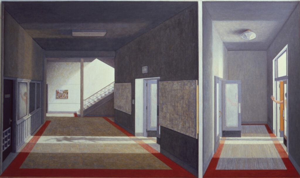
“The Last of the Sabine Women” (1978-80) is set in a school (or some other institutional) hallway. Though we can’t see outside, the corridors are bathed in light, and the scene is filled with doorways and windows and stairs, suggesting that the space may be empty now but is still potentially public. Against the distant wall is a reproduction of the Metropolitan Museum’s version of Poussin’s “Abduction of the Sabine Women” (1633-34). In Goldman’s canvas, there are no bodies to be seen (quite the opposite of the Poussin painting, which is as frenzied as Goldman’s is calm), but a series of doors are open, allowing us to see human-shaped shadows. On the left is a tall, thin shadow of what seems like a woman, possibly being carried off by another figure. One of her arms is raised in a pose that is problematic in Poussin’s original. Is she reaching out for help, crying up to the non-intervening heavens, or delicately waving goodbye? At the far right of Goldman’s painting is another figure, presumably male, who might be reaching out to help, or might be waving “So long.” It is interesting to consider this figure in light of the title: “The Last of the Sabine Women.” Is he stretching himself, futilely, to help, or is he just glad it’s all over? (Well, that’s that; there goes the last of them.) Though these figures are never fully present—which might be why they’re there—Goldman is interested in what we might call the figure of the “complicit witness”: a person (most often implicitly male) who sees what’s going on and remains uncommitted to entering the pictorial—and moral—space. There is a price to be paid for seeing what we see.
This is, of course, the exact issue at stake in the myth of Diana and Actaeon, who get their own painting in a canvas from1984. In the mythological source, the young hunter Actaeon comes across Diana bathing at a spring; startled and angry at being seen (and at the compromise of her all-female space), she turns him into a stag, leaving him to be chased and killed by his own hounds, who don’t recognize him. Goldman’s version is intriguingly topsy-turvy. Here, the scene has been moved indoors. Actaeon is as nude (and vulnerable?) as Diana. He is already wearing the stag’s head and seems to be fleeing from his raging dogs who are virtually chasing him to his fateful rendezvous at her bath. Cause and effect are deliberately jumbled. There is something hellish about his arrival: he is stumbling down the stairs into the dark. In Goldman’s world, people love spaces that overlook each other, and stairs often promise—but frequently in illusory ways—the hope to get up, get out, get free. Her indoor bath is architecturally connected to a room where a stag’s head is mounted on a wall—presumably (but not necessarily) a room from Actaeon’s estate. It looks like he ought to be right at home—but instead, he is a victimized seer in a stranger’s space.
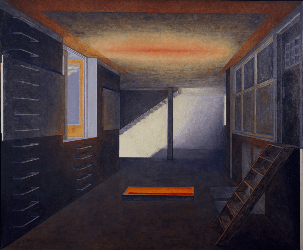
It is a short step from these lovely, if compromised, rooms to Goldman’s awesome and deeply disturbing “Chamber” series, which are not in the least shy about making it clear that the spaces depicted are designed for incarceration and death, and that the chambers are made by humans to kill humans. The handsome artisanship of geometry is still everywhere on view; the walls are as mottled and painterly as ever. In “Chamber I” (1981) we overlook a corridor (as we did in several of the “Room” paintings) that seems to be an homage to 15th century exercises in perspective. Perspective is a complex triumph of the Italian Renaissance. On the one hand, it celebrates reason and rationalizes sight. On the other hand, by placing the viewers in a very particular point of view, it may also anchor them in place: I am standing here, frozen in this spot, looking. At the end of the corridor are concrete staircases going up and down. To our right is a wooden stepladder that leads to a door, possibly locked, possibly to small and cage-like interiors. On the walls to the left are rows of stainless steel rungs. One set leads to an open window letting in the sky on a beautiful day. The other set just leads to the ceiling; ascension may lead nowhere. Sometimes, in retrospect, it seems that all of Goldman’s Rooms have a little bit of gas chamber to them. The rungs also raise questions about the role of art in mankind’s worst deeds. On one side of the corridor are two blank boards—as we have seen elsewhere in the “Room” series—that could be used to paint on, one of which is entangled with the rungs. The rungs, depending on their scale, could be seen as the handles to a print cabinet in a toney art gallery. In the center of the floor is a hole that lets us see that on the level below is an intense, blazing orange light so strong it projects its fiery heat onto the ceiling above (which is made up of those perspective-affirming tiles). Everything that is potentially elegant is elbow to elbow with the monstrous, the beautiful abutting the terrifying.
The “Chamber” paintings are extraordinarily powerful, as is all of Goldman’s Holocaust work. Though they have no figures in them at all, we still feel a bit like voyeurs. To look at just one more, “Chamber IV” (1982) takes us indoors, more or less, to the gas chambers. Once again, we are asked to consider the amount of imagination and artisanship it took to build all this. The floor is made up of tiles, rendered once again in perspectival space. Your better class of motels have floors like this. There are pipes in the ceiling that pay homage to abstract sculpture. From each pipe, a wick of gas is escaping that, if turned upside down, could be flowers in an autumnal Anselm Kiefer landscape. On the left wall, a towel hangs, reminding us of the horrid Nazi lie that inmates would enjoy a shower. There is no wall to the right: this shower room is open to the snowy night where we can see a transport train parked. In the room’s center is a huge transparent vat which is gently overflowing with poison gas, but also gives or receives a column of twinkling golden light (a return to the motif of the hideous ascension). These are spaces that have been constructed with reason and imagination, and we are being asked, in part, to see them with the same imaginative delight that a 15th century audience would have had at the amazing trickery of perspective.
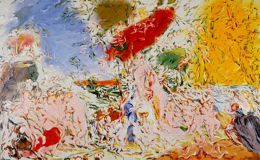
In my mind, the “Variation on Rubens” series is the best possible thing that could have happened to Goldman as a painter. It shook his eye, hand, and mind. It’s as if he moved on from the tightness of the High Renaissance (and all that perspective) to make the sweep and looseness of the Baroque his partner, and the results are amazing. It sometimes looks as if Goldman’s paintings were being transported on the back of a truck which hit a serious bump, and all of his delicate and mottled brushstrokes were knocked loose from each other. But they are having a great time now. The Rubens to which this is related, “The Feast of Venus” (1635-36), is being creatively reread at every turn. (I liked it that Goldman calls these works “Variation on Rubens,” rather than calling them “Homage.”) “The Feast” is exuberant and strange. The celebration of love is staggeringly complex, with considerable attention paid to the hierarchy of those who serve the goddess. There is even room for Rubens to use his wife as a model of one of maidens with whom a satyr is having a particularly good time. In Goldman’s “Variation,” all of the painting’s psychological issues are erased. Characterization and individuality are gone. The architectural elements in the background are severely minimized. As crowded as it may be, everything about Goldman’s “Variation” is a breath of fresh air.
Where the Rubens encircles the main scene with plenty of cupids and cherubs, Goldman has a virtually endless supply tumbling down from the heavens. They are, of course, not really cherubs anymore: they are reduced (or elevated?) to sets of curves. Where Rubens has the lushness of flesh everywhere, Goldman has the lushness of painterly curves, suggesting perhaps that for him, eros is not being celebrated by flesh, but is instead being celebrated in what the painter makes. Compared to Goldman’s version, the Rubens seems like a closed system. Here, on the other hand, color and line shower down on us like grace. The Rubens has a very warm, almost mossy palette. Goldman has read Baroque color through a lens of Matisse. Goldman selectively sees the inner structure and logic of Rubens’s colors and gleefully amplified them. He has seen the areas where Rubens concentrates some of his bolder colors and strongly emphasizes them: a woman in the original enters the scene in the lower right corner wearing a purple dress, which now becomes a purple highlight to that whole area of the painting; the trees in the upper right are bearing ripe fruit, which is now a bright yellow patch in that corner. And then, of course, there’s the red. Swaths of red cloth have been transformed into bright red areas on the canvas. And most of these zones of color are rendered as Matisse would in many of his canvases—as perfectly flat, unmottled paint, proud and out there, calling attention to themselves.
Over the next decade or so, Goldman seems to have thought more and more about the ways that he could express himself through abstraction. “Santa Giuliana Swimmer” (1985) has many of the elements of his outdoor, mythological paintings like “Tempest” (1986) but the figural aspects have been dramatically reduced. A very small portion of a swimming person is seen in the bottom register of the painting; Goldman’s primary interest has moved more to a floral zone just above the pool, and perhaps even more than that, to the distant landscape and the sky at the top. After this, Goldman produced a series of virtually wholly abstract paintings, dominated by strong shapes in a blazing orange red. These too are done in almost entirely flat applications of color. My own favorite of these is among the least typical, a work called “Al’s Gal” (2002-03), which is both less red and more mottled than several of the others. Reds, yellows, and a more subdued orange seem to be dancing around a green center that is liberally softened by purples. It seems to feel no gravity, though its shape is maintained by how tightly its various pieces hold onto each other.
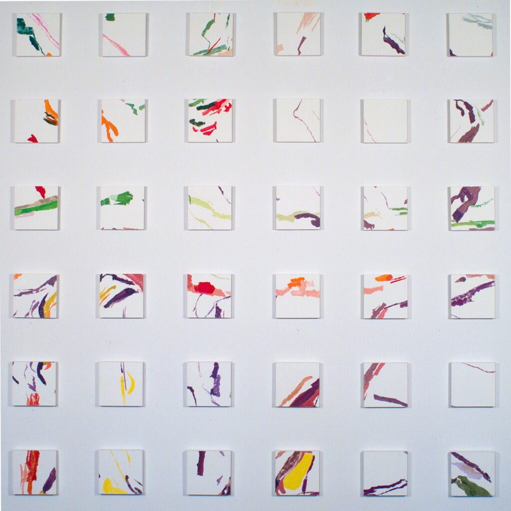
Cohesion becomes an increasingly central issue for Goldman through this time. Things want to come together; things are on the verge of blowing apart. “Elysian” (1998) consists of 36 small panels that appear to have been conceived of as a single abstract painting transferred, a small amount at a time, onto 6 x 6 inch pieces. Between each, there are what I take to be 6 inch spaces. While I wondered what the original work as a whole would have looked (and felt) like, its separation into portions seemed central to the point. A closely related work is “Feldafing II”; Google tells us that Feldafing was the name (and location) of a post-war holding area for displaced persons who survived the concentration camps. This makes the distance between the painting’s panels seem eloquent and mournful in itself. It raises the question of whether unity between things so forcibly fractured could ever be possible again. It also suggests that the white spaces between the panels were, to the artist, a little like control rods in a nuclear reactor. Taken together, the diminutive squares might have had too much energy, too much power; the beauty and the pathos we can handle is deliberately kept incomplete.
And so begins what we might think of as the “White” phase of Goldman’s work. Virtually all of his canvases from this point on feature large proportions of white space. By and large, his painting becomes more linear and each one seems a document of how the blankness of the white keeps elaborately drawn lines apart, or sometimes calls attention to itself as the missing piece. “Capri Red Cave” (2012) is part of a group of monochrome variations of what Goldman saw in photographs he took in Europe that suggest how powerful a partner nature can be at its most ordinary and most spectacular. Goldman’s lines are febrile and crowded and the work as a whole looks frankly anatomical, even disturbingly so. It suggested to me that before we wax philosophical about how persons decked out in their bodies behave, we ought to pause and recognize that life itself can be a messy business.
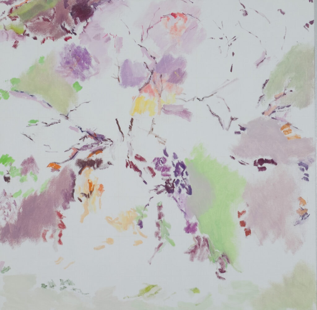
Goldman’s work could have gone a lot of different ways at this point. One might have been to produce canvasses like “NZ Spring” (2015), which seems a celebration of pure loveliness. There’s plenty of white space, but the profusion of lines has given way to diluted patches of color. (If Goldman had ever given himself to stained canvas, the works might have looked like this.) The palette is pale and subdued, and the linear aspects seem happy to stand down and let the loosely painted sections hold our eye. The colors could have been taken from the pastel tints of French lithographs around the turn of the century. The whole thing suggests a forest floor, but a number of the small painted forms just might feel figural. Once again the powerful claims of gravity have been dispensed with. The composition seems to be arranged around a series of circles, some of them enclosed and some enclosing; the painting as a whole is both placid and wild.
And then we reach the work for which Goldman has been known the past few years: the extraordinary “White” paintings, which I think are among the most remarkable paintings being done in Cincinnati—or, possibly, most anywhere nowadays. He showed a group of these at the Philip Meyers Gallery in 2015. Starting with a few rather ordinary photographs, mainly of forest and scrub brush in New Zealand, he converted their forms to thin, multicolor tendrils of dry paint, often pushing to see how few lines he needed both to show the shapes he was interested in and to hide them as well. It is amazing how a small handful of photographs engendered so many excellent, absorbing, and complex paintings. Following up his career-long interest in mythology, he centered a number of those earlier works around the myth of Daphne, the nymph who is granted her wish to be turned into a tree to spare her from being raped by Apollo. Those paintings were often magical evocations both of the presence and absence of the nymph, and of the tree that is her destiny, and ultimately of paint altogether. She’s there, she’s not there; it’s fatal to lose your humanity, it’s an eternal reward to become indistinguishable from nature. As he had done with the Rubens paintings, Goldman substitutes paint itself for eros. It’s a triumph of the simplicity of means, though by no means a simplicity of content or effect.
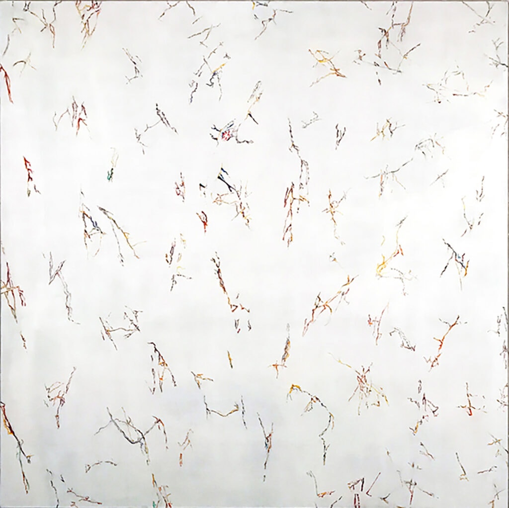
There is still a Daphne painting in this exhibition—“Daphne’s Wood” (2013)—but Goldman has continued to develop his ideas, evolving from the set of painterly tools he’s been working with for more than a decade. One thing that struck me is that the newer work is less and less indebted to the conventions of landscape. The horizon line, which in some of the earlier “White” paintings might be invisible but was generally implied, is now gone completely. In a work like “NZ 13” (2016), for example, the painter’s marks now look as much like diagrams of genetic code as they look like botanical elements. Each form seems to be part of a regimented array emerging from a shroud of fog. They are virtually arranged in columns and rows, and seem to be playing with the same tools of organization and reorganization that the paintings with small squares, like “Elysium,” were. But there is less promise that there is a landscape to be reassembled here. This might be the product when you take issue with “cohesion” as the best way to resolve the issues between the parts and the whole. These parts are strongly resistant to being hierarchicalized. In sacrificing the tools (and rewards) of conventional landscape, Goldman is, in part, weighing in on the discussion of the relationship between landscape and abstraction that has been one of the ongoing issues in art history at least since a famous exhibit at the Whitney Museum in 1958.
In some of the most recent paintings in the show, Goldman suggests new directions he might be interested in exploring, still using this same painterly language. “Forest View” (2022), for example, includes tightly measured shapes as well as lines, calling to mind earlier pieces like “NZ Spring.” And the title “Ukraine Woods” (2022) suggests another whole door that might be opened. It goes back beyond the earliest literal forests of the Daphne series to bring us up short with the political implications of the title. But I wanted to conclude with a second look at the series of photo boxes from 2015 named after the Wai-A-Tapu geothermal area in New Zealand. I did not find them easy to see (issues of glare and of having to crouch) but much easier to respond to than I did eight years ago. In each, Goldman has mounted a photograph printed on an aluminum plate in a box and layered it beneath a painting done on transparent plexiglass, separated by an inch or more of space. I was struck this time by how rich they were. As far back as his earliest “Room” paintings, Goldman has valued (and questioned) the beauty of the painterly surface, the flat area of a canvas made rich by the patient application of paint in layers of glazed colors. The photo boxes are glazes on steroids—glazes deconstructed down to their fundamental constituent elements. We look at one image through the lens, or overlay, of another. Some of the photographs are positive prints, but some are printed as negatives, darkening the whole and increasing the sense of the romantic and the gothic. The background print and the foreground painting are related to each other, but also very distant—in medium, colorways, and wholeness. The bottom layer contains in some form the entire scene, and the top layer represents the painter’s response to it, dramatically amplified in color and dramatically reduced to carefully curated handfuls of lines. They made me think back how the Rubens paintings seemed to have jarred loose the tightness of his earlier paintings. These boxes celebrated richness of effect with economy of means; it is as if we could see how the artist was seeing and calling to our attention multiple things at once. Sealing the box closed was opening a door to his audience. It was his way of showing how a language of painterly richness has found a home with him. It can continue to settle in for a while.