Matt and Paul Coors founded the Publico Gallery in Over-the-Rhine in 2003 and ran the operation until it closed in 2008. Ten years later, the Coors brothers are displaying their own works at the Clay Street Press Gallery, just a few steps from their former space. The show highlights the artists’ shared commitment to conceptual density and precision craftsmanship, their determined merging of imaginative and technical intricacies. Matt designs vibrant patterns and laser-cuts them into felt; Paul renders photorealist forms with a ballpoint pen. The harmonies between their exhibits resonate not at the levels of medium or style but that of labor, with both men deriving kaleidoscopic complexity from the patient, almost meditative layering of razor-edged details.
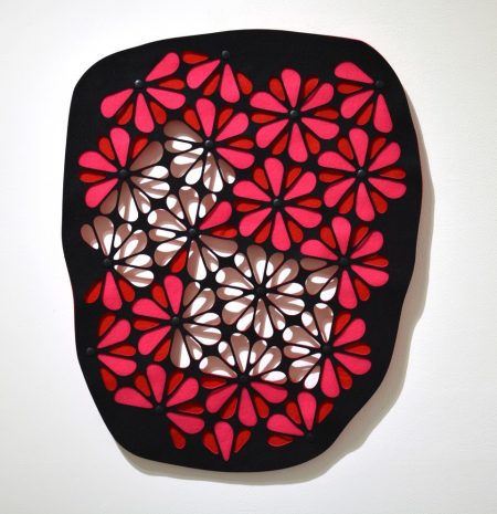
Matt’s Very Well Then exhibit follows on his years of practice as a graphic designer, making posters and promotional materials for CincyInk, the Oceanside Museum of Art, the Periscope Project, Knockaround, and Double Break, among other art venues and small businesses. He also works as an insect photographer, finding plentiful subject matter in Cincinnati’s woods and parks. Dappled wings and abdomens, segmented limbs and antennae permeate his photos while also informing the Clay Street exhibit, much of which conveys similar fascination with pattern and articulation. Geode 4, for example, superimposes three layers of synthetic felt on a backdrop of white plaster to produce floral effects—or, to honor the title of the piece, the look of crystal meshwork that inhabits the interior of certain rock formations. The felt tendrils that outline the crystals lend the piece its visual sophistication while embodying its fragility: if not for the snaps at the center of each color-blossom, the piece would stretch and eventually tear from its own weight. Coors enhances the beauty of the piece by solving its most urgent technical problem. Aesthetic appeal and structural integrity prove interdependent.
Matt Coors, 2018
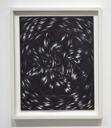
Coors focuses our attention on structure by delineating multiple geometric patterns within his pieces, locating angles within undulation and throwing borders into disarray. Geode 4 locates squares and rectangles hiding amid the floating crystals, highlighting the box-shapes by emptying their interior petals of the reds and pinks that dominate the piece. Yet the warm colors remain as felt backing, so that light cutting through the white blossoms casts taupe shadows, at once accentuating the thickness of the artwork and magnifying its internal maze. The ribbon of shadows insists that we look not just at the piece but through it, perhaps even with it, as the felt provides a lens for objects in the background. The results recall the effects of stained glass, whose attraction lies not just in its own materiality but what it projects, the way it irradiates the space beyond itself.
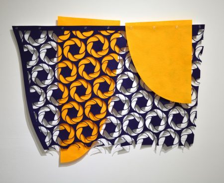
Hoard 1 produces gentler projections while enacting a more emphatic subversion of boundaries. By contrast to the Geodes, its layers forego seamless integration and appear almost deliberately disjointed, as if insisting on their own singularity. They occasionally engage in startling moments of collaboration, as with the left-center of the image, where a downward fin of yellow confers a three-dimensional quality on stylized rope coils. Yet the right fin, which descends in the other direction, asserts its identity by obscuring the pattern almost completely. Lines of containment begin to fracture: the yellow swatches burst the navy edging at the top and bottom of the work. Ragged shadows at the base further connote the frame’s disintegration.
Matt Coors, 2018
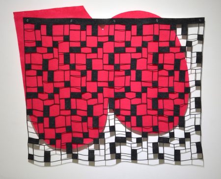
Leaky borders similarly characterize Coors’s Bathroom Tile, as a bright, fluid backdrop spills beyond its monochrome surface. According to gallery owner Mark Patsfall, the artist based that surface on the recollection of bathroom flooring in his childhood home. With such autobiographical flourishes Coors remains engrossed in the interplay of regularity and disorder, creating the feel of haphazard design even as he quietly systematizes the linear units of dark and empty blocks. In one way, the arrangement matches the spirited tone of the Geodes, and complements the nostalgic strains of the Sunset drapery hanging on the opposite wall. Yet, in another way, the cerise pools add a touch of dread to the exhibit, nodding to memory as something other than reverie, something that eludes control, imposes itself without warning, reverberates with suffering both psychic and corporeal.
Matt Coors, 2018
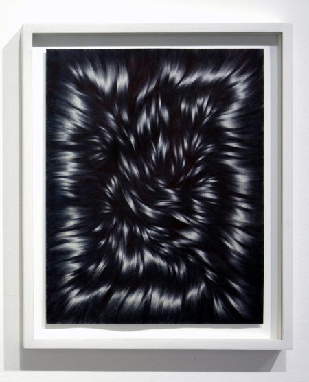
Whereas Matt Coors conjures emotional dynamics through high-concept renderings of memory, his brother Paul generates such intensity through virtuoso technique. With his RUBBLE exhibit, Paul offers us portraits of coiled and flowing fibers, all of which look at first like high-resolution photographs of human hair. A closer vantage, however, discerns the strokes of a ballpoint pen. In Ballpoint Art, Trent Morse observes that artists admire the pen for its “layering capability…its thick consistency, its sheen, its everydayness and its reluctance to be erased” (9). The medium permits Paul to itemize each fiber, to layer and braid in ways that lend contour and bounce to the visual field. The resulting chiaroscuro moves past lifelike rendering toward hyperrealism, attaining a three-dimensional texture while also drawing attention to the process behind the effect. That process is akin to a high-wire act, as the non-erasable ink leaves little room for misjudgment.
Paul Coors, 2018
The degree of difficulty takes on added resonance when we notice that each piece comes with a dedication, several of which are keyed to the talents of their specific addressees. Coors dedicates one to Bill Renschler, a photographer and painter whose art has recently hung in Cincinnati’s IrisBooks Café. The filaments in the drawing form a convex frame-within-a-frame, and inside that, a ropey weave that bursts with the secret liveliness of inanimate things. The picture’s significance cannot be exhausted on single or even multiple viewings; its center sucks inward like a vortex. Beside this loving assessment of a fellow artist hangs another tribute, this time to Dana Ward, whom Patsfall describes as having a well-known passion for cars. Whereas the boundary for the Renschler drawing resembles a picture-frame, Ward’s looks like a tire mounted on an ornate wheel. The hub, the spokes, even the lug holes embed themselves within the mass of fiber.
Paul Coors, 2018
Other forms present themselves as well, depending on what we project and where our gaze alights. Coors appears to acknowledge as much with RUBBLE, for Emily France, which places amid the locks a cartoon portrait of the artist, seated calmly and with flat expression, holding an empty placard. Initially, the portrait reads as a statement of protest without purpose, an outcry with no message. Yet on further consideration, it invites the viewer to invent meanings from the raw materials Coors provides, to fashion a mental inscription that focuses the picture’s signifying potential. That invitation does not entail any abdication of artistic responsibility, but instead foregrounds the idiosyncrasy of reception, accepting the unpredictability of the gallery as interface.
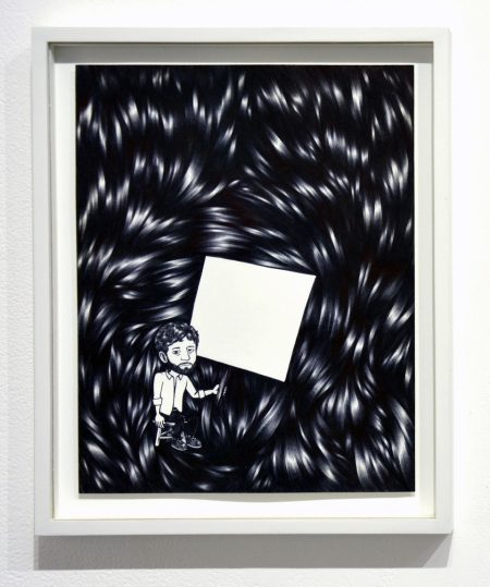
Paul Coors, 2018
At least as important, the cartoon affords a stylized view of the artist’s hair, establishing a visual rhyme with the rest of the image and with the whole RUBBLE catalogue. The intertextuality recasts the collection as pieces of the artist in two senses, at once products of his imagination and material extensions of himself. The poignancy of the double-entendre comes partly from Coors’s investment of time in the drawings, as well as the concentration and physical discipline they require. But it also comes from the nature of the drawings as gifts, as distillations of himself into charged artifacts.
Paul Coors, 2018
However moving that generosity, it coexists with awareness of the object’s transience, its tendency toward decay. The title of the exhibit suggests as much, as do the front and back covers of the book that reproduces Coors’s ballpoint art. (The gallery celebrates the release of that book on May 12, from 4:00pm to 7:00pm.) Its covers, which also hang in the entryway to the show, include marked differences from the book’s contents. Instead of a pen Coors uses a marker; instead of soft-seeming fibers he depicts an expanse of scattered brick. Given the gallery’s location, the covers may recall for some viewers the more troubled moments in Over-the-Rhine’s history. Given our political moment, in which longstanding efforts toward democratization face serious threats, the visual rhetoric of demolition appears all too timely. Such turmoil, though it hardly negates the social affinities within the book, nevertheless encloses that book’s contents. Paul’s work here parallels Matt’s in its concern for which enclosures hold fast and which might be transgressed.
The border between the brothers’ exhibits is, on first consideration, quite clear. Even were the materials not so distinct, no one would confuse Matt’s vivid palette with the muted tones of RUBBLE. Yet, if we take a more playful approach to the relation between language and visuality, the pieces are all felt objects, knotted together with patterned filament. More prosaic yet no less powerful, they are bound by a worker’s ethos, a maker’s dedication to exactitude and slow reward. These threads of kinship may not be obvious, but the delicacy of the attachment is itself meaningful. That delicacy is the very logic of the show.
–Christopher Carter
Works Cited
Morse, Trent. Ballpoint Art. Laurence King Publishing, 2016. return.html