“Art Ascendant” at Cincinnati Art Galleries on 6th Street is a great show to see on a fall day. It’s a full show, with about 100 works on display by about 20 artists covering all of the gallery’s walls. The exhibit drew upon many of the CAG’s stable of living painters (and one sculptor). In the interests of disclosure, I ought to say that while some of them were new to me, some of them were artists whose work I have seen for decades, and a few were by artists I have known for decades. I saw the show on a grey November day and the show offered a bright and welcoming blast. These are artists who are ease with color, for both representational and expressive purposes. It is clearly a fall show; the works on display had more than their share of oranges and purples. “Art Ascendant” was canted towards landscapes (or cityscapes) of many sorts, though there was some figurative work. “Realism” is an aptly suspect term, but it is fair to say that you would be able to recognize what you were looking at in almost all of the paintings. Taken together, the artists put on some pretty fine lessons in varieties of realism and ways that paint and reality stretch and challenge each other.
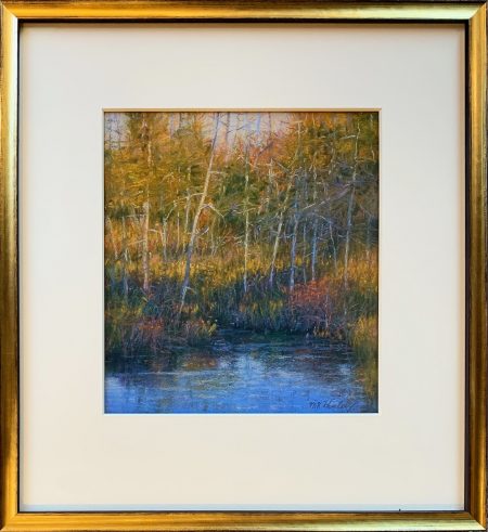
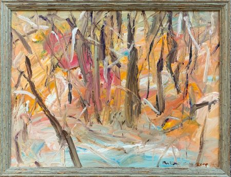
Katherine Hurley’s pastel “Chaos” (2020) is a perfect work to see in November. It depicts a fall sunset and there is a touch of chill in the air. We look across a small patch of water at the shoreline of what might be a pond. The water is deep blue, the trees are part bleached white and part blue from reflected light, and yellow weeds and dark shadows are woven through the floor of the woods. There are touches of orange throughout; it is hard to tell whether they are intended to denote the color of some flowers, or of turning leaves, or of something that has caught the orange light of the setting sun. The title, “Chaos,” is telling, because there is nothing conventionally chaotic about it. There is a sort of randomness to what we are looking at (as there was in a number of other landscapes in the show), which here contributes to making it feel as if the moment being captured was private and unplanned. The image does not rely on the conventional formal elements of the picturesque. Perhaps the sense of chaos comes from the proliferation of lovely, ragged marks out of which the picture has been made. The work has taken up the challenge of suggesting a harmonious whole out of these rigorously individualistic parts. Stroke by stroke, a sense of pattern and depth emerge. Cool abuts on warm without it feeling calculated. The feel of the pastel is that form and coherence emerge from, and are made out of, the potentially chaotic love of mark and color.
Keith Klein’s “Random Harvest” is also, as the title might imply, about the relationships between a painting’s parts and its whole. In this work, Klein practices a sort of inverted pointillism: instead of each dot representing, as it does with Seurat, a sober analysis of the constituent elements of color and form which cohere as we get some distance from them, these dots seem to suggest the decomposition of sober form and color into a multitude of wild spots. The result is a painting that is strikingly, almost dizzyingly, animated. It looks as if each spot of paint has autonomy and can choose whether to perch on a larger form or to fly free. The title “Random Harvest” seems designed to evoke fall, and one could naturalize the look and purpose of the painting: in admiring autumn leaves, still on the branch or as they fall, are we being drawn to the parts or the whole? But I prefer to think here that the spots and dots, whizzing around like tiny UFOs, represent a gleeful attack on coherence. The parts have successfully challenged the whole.
We are also invited to question the relationship between parts and wholes in Leslie Shiels’s “Three Wading.” The three who are wading are dogs, and though they are expressive and individualistic, they are also sculptural. The big story here is the water they are wading in. What is it like as it flows past them and how is it altered by their wading through it? The water is as sinuous and systematic as a contour map where each change in elevation is coded with a new color. The water has been transformed into something linear, taking on a virtually infinite number of shapes. There is a general uniformity to the thickness of the brushstrokes, nothing particularly subordinate to another, their equality giving them lives of their own. Sometimes the lines bunch together forming a new shape, like fingers, or petals radiating out from a center. The dogs are monumental but almost incidental; the painting allows the energy to flow out from the surface of the water.
There is a lot of interesting thinking going on throughout the show about what constitutes a landscape. Paula Risch Head’s “Fall Reflections” is practically the opposite of Hurley’s “Chaos,” painted out of veils or curtains of colors with the palimpsest of individual markings having been excised almost entirely. We are drawn into this lake scene by an inviting triangle of reflected light that points to the distant shore, a classical trick of vanishing point perspective. The reflected light is brighter than what we see in the sky, reminding us that mediated perceptions are often more vivid than the things we look at directly. The shore might be made up of trees or rocky palisades: they are painted as if they were made of vapor. Unlike Shiels’s “Wading,” this is almost a lineless painting except for some vertical traceries at left and right that clearly indicate tree trunks. But even there, we cannot tell how tall they are or, really, much about the scale of the scene we’re looking at. For all I know, it was painted en plein air, but that’s not the feeling I get from it. Rather, it has more of the feel of something archetypal, or something rooted in memory, either of an experience or of an appreciation of the rich history of American landscape.
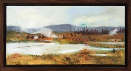
Kevin Muente’s wonderful series of panoramic landscapes do not look in the least as if they were painted en plein air. His paintings are in conversation with how a camera sees. Since even a very fine camera cannot capture both deep shadow and bright sun as well as the human eye can, Muente is content to paint within the limits of the camera, letting the bright light of the sun blow out the detail. Though the attraction of panoramic photographs is their intense illusion of presence, we do not, in fact, see panoramically, though we can train ourselves to take in such elongated visual fields. It is a pleasurable distortion. In such works as “Poplar Creek, Fall Shadow Play,” Muente is interested in capturing the effortless elegance of the arbitrary arrangement of ordinary things. He paints the sculptural dynamics of debris. The paintings end up with an arresting mixture of the epic and the casual. In works like “Barnes Creek,” he paints as if he’s the first one who’s ever wandered there. If there is something random about the places he paints, there is something intensely specific about the light. He places our point of view just inches above a rippling stream, perhaps as it is about to cascade into a waterfall. The water is sculpted and seems to be bursting with reflected light that is, as it was with Head’s painting, more intense than the light in the sky.
Like many of the best landscape painters, Valerie Shesko works where painterly abstraction can be made to take on topographical form. “Blue Ridge,” for example, is made up of brushstrokes and lines and grids and veils all surrounding a sensual but substantial curl that marks the horizon. I’m not sure if I end up feeling that the painterly marks find one moment where they can be tamed into a lovely, distant, natural shape or just the opposite: the sturdiness of one real thing in the distance generates the beautiful frenzy of painted marks all around it. “Blue Ridge” is a meditation on the painter’s materials that also becomes a meditation on space: when we come across a white spot, do we read it, say, as a distant river, or—equally exciting—as a place where we’ve gotten down to bare canvas?
Shesko’s “Big Sky” is less frenzied; “Emergence” is even more frenzied, but these are the elements out of which she explores the interplay between brushstrokes that represent the seen world and those that register the painter’s feelings and almost physical athleticism. “Big Sky” takes us back to discussions about the roots of American abstraction in 19th century renderings of the landscape; the horizontal banding of colors made me think of what Rothko and Frederic Church had in common. The particularity of the painting comes not from capturing where we are, but of when we were there. We are looking out at a distant deep purple horizon line as the space between two different skies are beginning to resolve. Like theater scrims overlaid on each other, a near layer of thin clouds, orange with the reflection of the setting sun, is giving way to the blue and white of more distant clouds and sky. As with “Blue Ridge,” there is a patch of white that reads both as the impossibly palest of clouds or the vividly proximate appearance of the bare, unpainted panel.
Bukang Yu Kim’s “Orange Scape” shows a kind of perfect alliance between brushstroke and shape, the tools of representation and the things represented. Each paint-laden marking is a tree or the ground carpeted with orange leaves or a zone of water (or possibly snow) between where we are and all that. Nothing of abstract expressionism is lost on her. “Orange Scape” is deeply rooted in the in the logic and geometry of landscape; we seem to be looking up from the base of a wooded ravine up the steep slope of a hill. But there is also an explosive quality to it. It is as if a moment of wild agitation, of painterly passion, took over and though it has now passed, the painting is its memorial.
There were figurative works as well, though I wasn’t sure how well they fit in with what I took to be the main thrusts of the show. I did like, for example, Ray Hassard’s “Bump #5,” a picture of dodgems on a track, commemorating America’s love of living out fantasies of danger. In “Bump #5,” we see as many adults as children aiming to careen their fiberglass and rubber cars into each other. Their postures are evocative—some are hunched over their steering wheels, others slouch back away from it—though their faces are much less so. The glistening cars are bunched along the outside edges of the space. At the center of the picture is empty space, the metal floor reflecting a yellowish light whose source we cannot see; it would be lovely to look at this reflected light next to Head’s reflections on the water in “Fall Reflections.” The mottled metal floor, both dully metallic and glowing with light, is the most beautiful part of the picture. If Caillebotte had lived long enough to have seen such a thing, he might have painted it too.
But the great strength of the show is in its landscapes. Lisa Molyneux is drawn to landscapes that not only don’t have people, but couldn’t. She has written that she is interested in swamps and backwaters because, in part, they have been “left completely alone,” and so can flaunt their “total lack of tidiness.” “Grace and Charm” is such a work, a panorama of a place that would be inaccessible to us. If this were a Farny, the plumes of white would be Native American campfires, but here, they are just patches of dense fog. There is a kind of forbidding emptiness to the landscape, as if it were of a stream that has overflowed its banks. Our position as a viewer is complicated, because while we might wish to be where we are looking, it doesn’t want to have us. Molyneux also has a monumental work in the show, the 44×60 inch “Memories of Rural New York.” There is no swamp that we can see, but plenty of mist. The billowing, sensuous clouds are worthy of Rubens. The landscape is divided into distinct bands of color: yellow weeds in the foreground, brown grasses behind them, purple trees behind that, and so on. Between the yellow and the brown Molyneux has sketched in a fence. I wouldn’t say I love it best of anything in the painting, but it seems to me it contributes to the painting’s subject, as suggested by its title. This is a piece as much about recollection as it is about terrain, and the flimsy fence suggests that those memories are both accessible and restricted.
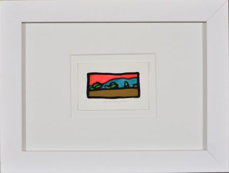
Molyneux feels free working in a variety of scales; I would very much like to see what Kevin Kelly could do in a truly large-scale work. Kelly’s work is distinct from everyone else’s in the show because of its hard edges and flat, unpainterly surfaces. His work builds off what I take to be the disarming discovery that if you take a doodled squiggle seriously and enlarge it, it has the look and feel of a distant treeline. He calls them “Archetypal Landscapes,” and sees them as the end result of “paring down the complexities of the landscape into its purest and most concentrated form.” I enjoy the way they suggest that nature is made of a jumble of forms, and that those forms can be severely abbreviated and yet still read to us as a kind of natural density and richness. Most of his works in the show were about 12×12, and I found myself wondering what it would look like if he were to play with bigger, more compound compositions. On the other hand, Kelly freely experiments with miniaturization. “Archetypal Landscape 25,” for example, is so small that it is under 1 ½ square inches. But it was evocative and suggested the same sense of tiny worlds brought into being by a mere curl or two. It glowed like a fragment of stained glass.
One interesting suggestion in the show is that there is a thin line between the faithfulness of an image to a recognizable world and the sense that an image suggests something beyond. Vision easily slid into visionary, and the familiar switched places with the uncanny. One of the most oddly haunting pictures on display was Molyneux’s “Dew.” On the face of it, it is another misty swamp picture, but this one seemed particularly magical and disorienting. Somewhere upstream of where we are situated, the sky empties itself of a violet rain. The world depicted here is both lush and bare, the sensuality both overflowing and stern. It felt oddly Edenic, experiencing all seasons at once, if we allow that Eden might have been a disorienting place.
I can’t quite explain the title of Adam Hayward’s “Two Suns,” except to suggest that it calls to mind a world whose physics are at variance with our own. It is entirely recognizable but is designed to make no logical sense, as if Maxfield Parrish went sketching in Giorgio de Chirico’s back yard. It is a reminder that when everything is in equally sharp focus, the overall effect is less real, not more. It features a very gangly tree in the center, with a hyperbolically thin trunk and yet dense and leafy on top. How can it stand upright? The orange sky is lush but spotted with white clouds as if they were some sort of powdery mold. It is another of the gallery’s fall pictures; the only thing moving here is a stream of leaves being blow off one of the lower branches. It is as quiet as “Random Harvest” was busy. Everything is teeming with life, but also a little bit diseased: it is magical in its own way.
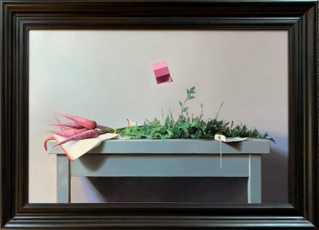
It is not easy to get a full sense of what Brian Burt is up to. He has a number of small scale still lifes of toys or games many of which are smaller than a sheet of paper. He is a meticulous photorealist who is attracted to absurdity. In “Imagine and Fly,” he paints an anthropomorphized Leggo firework sailing through the air like a new sort of superhero. Though the plastic piece says “Bang” on it, the Leggo guy trapped inside the rocket has an expression of consternation, as if he is not fully reconciled to his imminent explosion. But his larger and more complex works are truly masterful. “Cosmically Calm” is a tabletop still life with much of the austerity of a William Bailey. The chief object in it is a slightly purple, almost luminous bunch of carrots with a towering crown of leaves and stems. It is hard to tear yourself away from the leaves. They constitute a miniature world, like Durer’s “Great Piece of Turf”—the inconsequential that becomes epic. Close up, the leaves seem like a brilliantly rendered forest—the outer leaves catch the light, the inner ones are dark and mysterious. Pinned casually to the wall is a pantone color swatch with purple-lavender tones, only slightly less orange than the carrots. It seems to serve as a reminder that we should not get too caught up in the facility with which leaves can be rendered: it’s not a forest, it’s just paint.
Keith Klein’s “For Keeps,” shows a couple of dozen regular size marbles on a silver tray spilling out of the velvet sack, dwarfed by a single giant marble. The title brings to mind a child’s game of marbles that would have actual consequences; this time, we’re playing for keeps. But with the serving tray and velvet bag, it is, of course, very distant from the actual world of children’s games and the street-tough declaration of high stakes. It seems instead to be interested in the ways that the marbles represent treasures. But the painting wouldn’t be nearly as interesting as it is if this was just a “Rosebud” moment, a nostalgic treasuring of how much more valuable a memory is than the things that inspire it. “For Keeps” calls to mind a sort of cosmic landscape. Each marble is like a colorful planet and the giant one—far too large to be any sort of toy—is like a sun. The tray rests on a sensuously-rendered drop cloth that is yellow and rippled as fields of wheat just before harvest, and which recedes into a darker, sky-like purple in the back. He drooping cloth looks like a dark display of northern lights. We have moved quickly from children’s games to a perspective that takes in earth and the heavens. They all await a kind of breath of life to set them into motion.
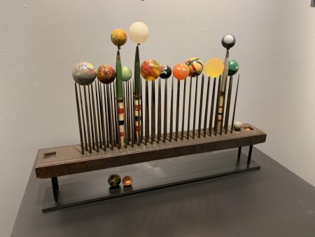
CAG has paired for this show a number of paintings with the found-object sculptures of Mark Serrianne. This is especially effective here, where “For Keeps” hangs over Serrianne’s “Distant Worlds,” a collection of rubber and clay balls set in a row on top of the sharp iron points of a farmer’s rugged and pointy flax comb. Serrianne is clearly in love with things and has written that his “studio and workshop are like a heavily curated fantasy museum” from which he draws the elements of his assemblages. He moves comfortably between objects that are reassuring and those that are unsettling, like the plastic imitation popcorn in “Double Feature” that look like teeth in a jar. In “Distant Worlds,” nine small globes are neatly aligned; this is what a model of a universe–though not, I think, ours–might look like in a rare moment of symmetrical if perhaps also catastrophic cosmic order. That’s an awful lot of planets very close in a row. Having the balls perch on the sharp iron teeth of a comb is like a medieval explanation of what holds the sky up over our heads. This is a model of a demonic universe: the sculpture has not been child-proofed, and there are more teeth to this comb than there are spheres. As Serrianne has written, he hoped to create the feelings of both “fear and allure,” and he has surely succeeded. The balls sit proudly like heads on pikes.
A few additional balls are sitting on or beneath the stand and a few are in an arrangement all their own. Every perfect alignment contains its own disruption. Unlike the glistening marbles of Klein’s painting, these globes are opaque. They are made, Serrianne tells us, of rubber and clay and were collected by him over the years. They are the abandoned playthings of people who did not own glass marbles, let alone silver serving trays. They look a little like glass only because they have been painted that way. People will paint on the elements of the base earth itself to create artificial marbles, and others will envision how those artificial marbles are imitation worlds. We can see a little bit of ourselves in all of it, if we try.
–Jonathan Kamholtz