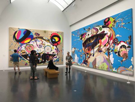
Incredibly, the Takashi Murakami exhibition officially broke the David Bowie attendance record of 193,000, making it the all-time highest attended exhibition in the Museum of Contemporary Art-Chicago’s 50-year history. Numerous prints Murakami had available for the MCA Museum Store were sold out, including an $11,000 print in an edition of 100. So the popular and commercial successes of TM will be the twin points of this article.
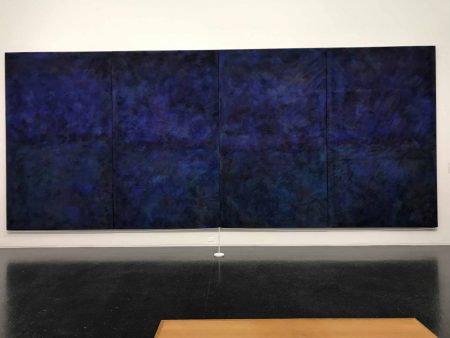
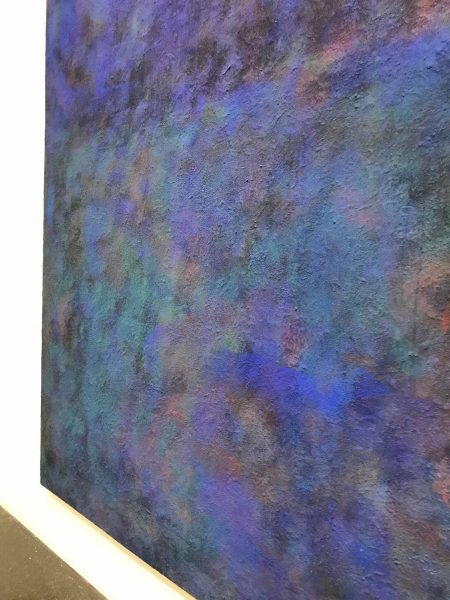
Murakami established his brand early, like his artistic godfather, Andy Warhol. Murakami is classically trained in art in Japan and his early work in this retrospective features several soft-toned and delicate paintings. These works give us no clues to his evolution since there is a disconnect between these gentle, Zen-like works and the uber-stylized, candy-colored, Pop sensibility, commercial-looking paintings and sculptures for which he is known. There is really just one transitional, large multi-panel blue/blue-violet monochrome in the exhibition that Murakami says he owes to Mark Rothko and it is a beautiful painting, as if Monet lived to paint into the 1980’s. Murakami is looking to the West.
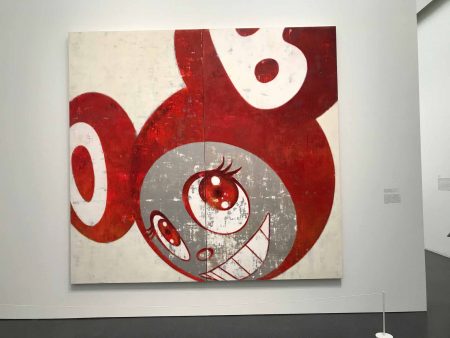
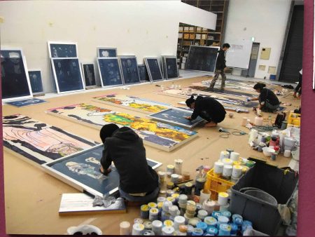
Abruptly, Murakami embraces Western Pop Art along with a style and imagery from Japanese anime and manga. He is famous for coining the term “superflat” to describe the highly finished, utterly flat look of his paintings. Pop Art, cartoons on TV, toys like Hello Kitty (Japan) and My Little Pony (U.S.) all consist of highly saturated colors and smooth (flat) surfaces. Murakami’s paintings, usually done by a commercial painter, look commercial. They dazzle the eye with their perfection. I looked closely at some of the earlier paintings and it took careful scrutiny to see the slightest whisper of a paint ridge here and there. Attention to detail never wavers, such as a beautiful, thin, flowing outline of a cartoonish eye or undulating lines echoing wave patterns common in traditional Japanese prints. The paintings are like richly made jewelry, dazzling and perfect. They are truly a technical triumph for whoever painted them, with Takashi Murakami acting as art director.
So how are they as paintings? Beyond their breathtaking perfection? A fellow artist asked me, “Do they feed your soul?” The answer is “No.” In this, Murakami and Jeff Koons are twins. They both employ a small army of artists and technicians to manufacture their work. They both recognize the power of a Pop sensibility. More so now, with the rise of internet imagery and software, we have our fingers on making anything ‘Pop’ with a keystroke. Both artists recognize the power of their respective brands and both have designed limited edition Louis Vuitton handbags. Murakami collaborated with Kanye West for the cover of the 2007 “Graduation” album that shows a Murakami bear sculpture, seen in this exhibition. Murakami has more merch, though, than Koons does and Koons has plenty.
So do we need our souls filled every time we look at paintings or sculpture? Certainly not. It’s not possible to compare a Murakami painting – whether it’s his Mr. DOB (Mickey-Mouse-Like alter-ego series) or his enormous, psychedelic mushroom paintings – with say Titian’s Flaying of Marsays or Van Gogh’s tender oil painting of a peasant’s terribly worn shoes. These paintings make us nearly weep. Murakami’s paintings give us a moment of joy, or incredulousness – “How did he do that? The painting is so huge and magical.” Who can resist smiling at his Smiling Daisies? Like Koons balloon dogs or giant flower puppy. Crowd pleasers! Yes!
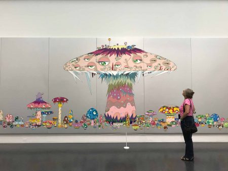
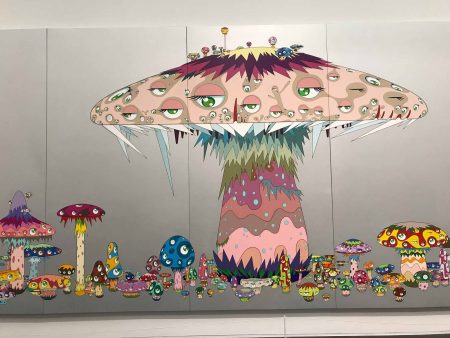
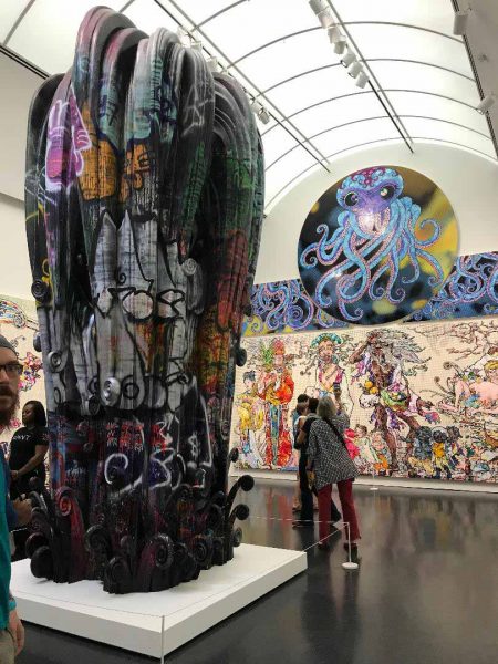
The MCA retrospective is, nonetheless, stunning. The artwork – enormous paintings and sculptures – is stunning, if not soul filling. The exhibition broke a 50-year attendance record. Crowd pleasing to the max.Walking through the exhibition is like tripping. Like being Alice in Wonderland. Like being a child again or being in Walt Disney’s head. Takashi Murakami has a boundless imagination. He repeats and alters successful imagery forcefully. There is no nuance here, simply the pulse of the times.
I don’t know Murakami personally so I can’t speak authentically about his self-deprecating hype. He’s loved and he’s maligned. Jerry Salz, a respected NYC art critic, has maligned him and I fully see Salz’s points. After seeing this retrospective, I prefer seeing one or two Murakamis amid a group show. They stand out for their technical brilliance if seen in the context of other work. Not every successful painter employs one hundred artists and technicians so the paintings of other artists look, you know, painted.
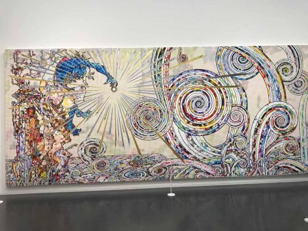
However, the Museum of Contemporary Art’s Michael Darling, the James W. Alsdorf Chief Curator there, sees Murakami as a comprehensive and dynamic artist. Murakami is world famous and might have stayed in his hyper-Pop mode. Except that the Fukashima nuclear disaster affected him and he deepened his resolve to delve back into his Japanese culture and researched arhats, who are persons in Buddhism who are worthy or perfected, far advanced along the path of Enlightenment. So it was bye-bye Mr. DOB, hello, Buddhism! His Arhats paintings still maintain Murakami’s signature cartoonish style – which is disappointing – but they are full of arhats in a landscape that, perhaps to Murakami’s cartoon-glazed eyes, seem serene and meditative. I think of Gustav Moreau, whose sleek and mesmerizing style earned him notoriety with the French Salon with his Oedipus and the Sphinx, given to the Metropolitan Museum, New York. Moreau transcended his celebrated life-like style and increasingly made work that became visionary and utterly abstract and totally evolved, especially his late watercolors which are a marvel of vision and bravura painting. Not so with the Arhats. They remain cartoonish Buddha-like figures.
A visit to the Art Institute of Chicago the next day was highly instructive, as the print department mounted an exhibit called “By the Light of the Moon.” It featured Japanese prints from the 18th and 19th centuries. I was reminded of the cartoon-like grimace of a dragon and thought back to Murakami’s one large simple painting of a dragon, all Asian blue against a white ground. I felt it was too cartoonish, yet is very like the 19th century Japanese woodblock print in the Art Institute exhibition. Grimacing kabuki actors with bulging eyes and exaggerated facial expressions suggest that Murakami is steeped way more in his culture than ours – other than borrowing very, very heavily from Walt’s Mickey Mouse for Mr. DOB. Murakami’s obsessiveness with pattern and repetition owe to the gorgeous patterning of clothing meticulously rendered in Japanese woodblock prints, and, ultimately, to the art of the Japanese kimono. The same skills that woodblock carves display in making the luminous and perfect Japanese prints are in play in Takashi Murakami’s paintings and sculptures.
A word about the title: Takashi Murakami: The Octopus Eats Its Own Leg. “The octopus eats its own leg” is the basic translation of tako ga jibun no ashi. Apparently in ancient Japanese folklore the phrase explains a situation in which one survives for the time being by feeding on or sacrificing oneself without receiving any outside help, but where one is ultimately doomed. An octopus can actually eat one of its legs if it is trapped or has an infection and the leg will regenerate. Murakami is the octopus, making new work – which is like cutting off a leg – in a complex global art climate where he is lauded as well as derided for whatever he does.
Takashi Murakami: The Octopus Eats Its Own Leg
Museum of Contemporary Art Chicago’s signature exhibition of the museum in its 50th anniversary year ran from June 6 to September 24, 2017.
–Cynthia Kukla is an artist and professor emerita of art living in Cincinnati, OH.
An incisive and concentrated examination of the art styles and technics employed by Takashi Murakami and the cultural influences that affect his art.
Cynthia Kukla gave a very thoughtful American view of a profoundly foreign view of the world. I agree the pop imagery is window dressing for art that prizes perfection in technique and execution.
Her comparison with Jeff Koons is right on.
Cynthia Kukla gave a very thoughtful American view of a profoundly foreign view of the world. I agree the pop imagery is window dressing for art that prizes perfection in technique and execution.
Her comparison with Jeff Koons is right on.