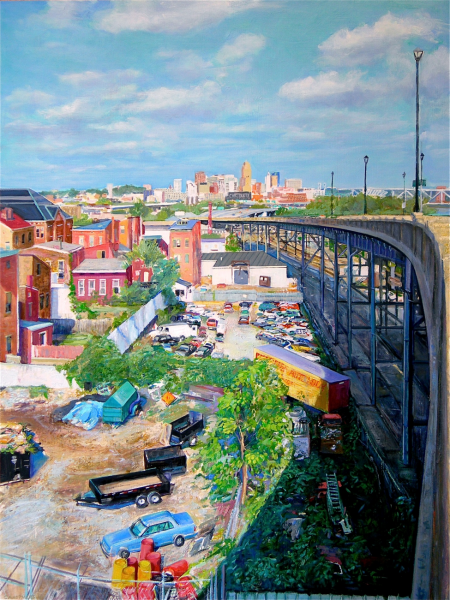
In Cole Carothers’s “Margin” (2008), we are in Northern Kentucky somewhere—I’m thinking probably Monmouth Street—where the roadway dips down under some train tracks. There is no glamor here, at least not in a conventional sense. Where we are has been zoned for what is called light industry, which typically means that the factories are neither picturesque nor cavernous, more like a big box retail store (which, by the way, Carothers has also painted) than a dark, Satanic mill. One thing that Carothers likes to show in his work is how many painted surfaces there are in our everyday world and how richly they are colored. The industrial grey of the bridge is relieved by the orange of rust coming through as insistently as anything in a color field abstraction; the concrete walls that line the pedestrian staircase down to the roadway look like they have been repainted after having been graffitied; even the pigeons have left decorations on the subterranean archways. And way off in the distance we can see the sparkling and multi-color Cincinnati skyline.
“Margin” is an excellent title for the painting, and an excellent way to get oriented for the works in this show. Time and again, when Carothers envisions the geography of Cincinnati in his paintings, he seems to imagine that the viewer is at or near the margin, the boundary, the dividing line. Sometimes we are looking in, sometimes we are looking out, and sometimes we seem to be doing both at once. In this work, we are standing at the edge of a staircase, not far from the shuttered loading docks of Trauth Dairy, looking towards the far-off glamor and elegance of Cincinnati’s tallest buildings. Our connection to the city is tenuous, but it is there: we could drive pretty much in a straight shot across the Southgate Bridge. In the world of the margin, connections may be difficult to come by, but they are always there.
I feel that I am a huge fan of Carothers’s more frequently seen works, the ones that are typically set in the corner of a studio looking at a canvas that might be a window or a window that may be a canvas. Over the years, he has painted highly sophisticated and even wise paintings that play with space and perspective, flatness and framing. In raising questions about the representation of space, they engage with ambition and beauty in one of western painting’s most persistent conversations. In fact, there is one of these paintings in the current show—there were several in Caza Sikes’s retrospective of Carothers’s work a year ago—called “Working Photo” (2003), where the painting is signed and dated on a painting-within-the painting. But in this show, the emphasis is less on the wit and daring of transforming and deconstructing the studio—the place in the mind and heart where art is generated–and more on the view out the studio window, the city itself.
In what Caza Sikes is calling the artist’s “Cincinnati Collection,” the paintings focus on the look and feel of a Midwestern river city and, most often, a city whose geography and layout could only be Cincinnati. Over the two decades or so of work in the show, Carothers has entered into some serious consideration of just what makes Cincinnati Cincinnati. He sees a visual logic to Cincinnati that seems loosely attached to some ongoing ethical concerns about how we view and have accepted the lines that shape our attitudes towards different parts of town. To Carothers, the Queen City is a maze of viaducts and bridges, elevated roadways and underpasses. These tend to mark the signs of a city defined by its boundaries, some paved, some watery. They are the demarcations between lowlands and highlands, neighborhoods, types of housing, and ways of living. Carothers’s Cincinnati is always at one end or another of one of these roadways—there’s always a place that is at the margin—and he paints in a remarkably non-judgmental way about what the roadways pass over, through, or skirt around. East/West, North/South: time and again, Carothers seems to propose, we’re all so close to real beauty, what are we arguing about? What is the point of these artificial boundaries that have used geography as an excuse?
Perhaps this sounds corny, but these paintings are anything but. There is no better painting at the show than “July Grit” (2010), an epically scaled (48 x 65) look down at the Western Hills Viaduct from somewhere up on the heights of CUF. The “grit” of the title might be calling our attention to any of several things, but I thought the most likely was to suggest that the lovely yellow autumnal light that suffuses the sky was due to haze or perhaps smog in the air over the Mill Creek Valley. On the other side of the bridge with its dozens of concrete arches are rolling hills, lush with green and practically devoid of signs of human occupation. It is as if the foreground of the painting captures the industrial clutter of today while the background could belong to Robert Duncanson’s Cincinnati. Industrial detritus gives way to pastel greens as lovely as a postcard from Tuscany. The picture is both a rejection and an embrace of the picturesque. On a second look, we see—as often happens in Carothers’s urban works—that junk, when rendered in a painterly way, has a visual magic of its own. Rows of detached tractor-trailers are slabs of paint with a sure sense of rhythm—one of many ways that the urban world for Carothers is built up of small pieces (highway arches, yards of parked cars, virtually numberless arrays of windows on downtown high-rises that must be maddeningly boring to paint) that repeat themselves until they make up a new and lovely whole. Carothers’s Cincinnati is about the lyrical magic of interconnectedness. It was easy for me to imagine how terrific “July Grit” would look at the CAM hung in the vicinity of one of the Museum’s Innesses, another artist who tended not to compartmentalize and keep nature apart from the human realm.
Carothers returns to a similar perspective on a clearer day in “The West Side” (2007). The work is subtitled “pons asinorum,” which literally means “bridge of asses,” but which is a term used figuratively to describe the point in a study of math or logic at which new learners have failed. Once again, the Western Hills Viaduct is seen as the place where the business and visual clutter of the cityscape gives way to an almost untouched lyricism of the hillside landscapes on the far side of the bridge. They are just this close. All the arches—which we know from reading the newspapers are steadily decaying—form a kind of urban church architecture (though there is also something of de Chirico in the oddness of their context). It seems fair to say that in many of these paintings, clutter and design are alternate versions of the same thing. “The West Side” is painted with an inclusive vision: trains are lined up neatly, a junkyard has vehicles heaped randomly; there are church steeples and factories; we see highway signs and graffiti, light posts and gentle autumn sunlight, pastel trees and garish blue warehouses. The painting surely includes a call to honor Cincinnati’s potential for greater interconnectedness. We construct our social environment by making distinctions that geography doesn’t support.
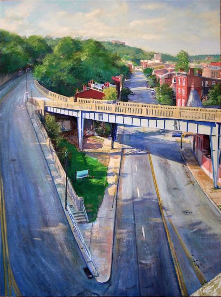
“Sixth Street Viaduct” (2007), which was also shown at Carothers’s Casa Sikes retrospective last year, is another one of the painter’s epic urban visions. On a brilliant sunlit day, we are looking from the railing of the very unprepossessing Sixth Street Viaduct as it starts its climb from the city center up to Price Hill. We can see the downtown of Cincinnati glittering in the background like some version of Oz. But in the foreground beneath us, before we can get to Oz, we see into the backyards of a dozen or so red brick tenements that are cluttered up with trash, typically of an automotive nature. There are trailers with two, four, and eight wheels, highway construction barrels in yellow and orange, junk cars in dozens of colors. There are five or six different sorts of fences, none of them quaint. There is plenty of scrub brush and sumac, but also trees, and backyards where people are trying to grow things. The rear view of anything, but especially a city, is rarely its most flattering vista. But Carothers wants us to see both—the distant urban glory, the casual accumulation of junk that might yet be of value—to assure us that this city is no Potemkin Village, a place of only false fronts. It takes the rear view to understand the whole economy. People are trying to make a living out of all this junk, and they are doing it within sight of the distant grandeur of downtown. It is fair to say, I think, that this is part of a larger economic analysis of how people live, one which is extremely thoughtful, and a little harrowing. It can also be lovely, when you have a painter who is open-minded and open hearted towards the clutter and the colors of contemporary life.
It is also fair to say that Carothers by and large portrays the nature of the way people live together in the urban environment without showing us any actual people. It is not that he can’t: “Schwartz Point” (2008), for example, captures that asymmetrical intersection with vignettes of people making their ways across the streets. But more frequently, we understand human presence by its absence and, in particular, by what people have left behind. The title of “Rooftops and Broken Glass” (2008) is a pretty reliable guide to the core of the painting, though we are left to wonder about how those odd shards of broken glass got onto the flat tops of these city walk-ups. Are we to imagine that kids have tossed their empties up onto the roof, or should we think that some other evening there has been a wild roof party, one of those archetypal signs of urban sociality? From the window where we are perched, we can see, as we often do in Carothers’s work, signs of the painted environment that the painter finds everywhere—here in the form of the blazon of a distant billboard. And at the end of the road that climbs past the houses whose rooftops we are admiring, a patch of forest awaits us in another of Cincinnati’s countless hilltops.
The show is generous in giving us a sense of how Carothers might have come to hone and develop his urban interests. In “Snow: Main Awning” (1983)—probably the earliest painting in the show—we can barely make out the awning in question in the street in the background; our attention is mostly held by the ventilators in black, grey, and white on the rooftops in the foreground. The painting owes a good deal to the tradition of the Ash Can painters, whose vision of big city life was a vehicle for an urbanized reinterpretation of Impressionism. This particular painting (along with its Whistler-esque title) is something like a tone poem in browns and greys; while it is interested in how an urban dwelling functions, it is less concerned than his more recent work in signs if economic life and striving.
“State and Warsaw” (2007) shows the artist’s interest in painters like Wayne Thiebaud, who sees fever dream roller coasters in San Francisco’s hills. Carothers relishes the geometries of a city defined by its hills. In “State and Warsaw,” two streets meet at sharp angles on two different planes: the street takes a hard turn and also seems to plummet downwards. It is interesting how many of the paintings in this show see the city as a multi-level operation: we are often looking down vertiginously into the concrete infrastructure of bridges, viaducts, and overpasses: cities make dramatic spaces in different ways from most rural worlds. Personally, I have never seen this particular intersection so deserted—but then, I have also never really noticed how lovely it is, how green and lush, how unhurried a neighborhood it can seem as the sun sets behind Price Hill and casts long shadows of trees and buildings across the road.
“Tone Poem 75 @ 75” is among the few paintings in the show that is not specific about its location, though I assume it is based on a photograph taken from the side window of a car as it sped along I-75 at 75 miles per hour. True to its source, but again unlike the rest of the works in the show, things are blurred. Some sparse trees and bushes dot a hill that rises up alongside us as we zoom past. It seems to be late fall or early winter, and everything we can see is in the yellow-grey-brown range. In terms of the sets of ideas the exhibit wants to play with, nature here is a not a bit player or an afterthought, but makes up virtually the whole of the picture. But we cannot help feeling that the highway serves as a filter. Nature at 75 mph is not the sort of nature Thoreau had in mind; our experience with the wild has been mediated by the way mankind generally chooses to experience the outdoors, without it having to make too many demands on him. But once again, it seems to me that Carothers wants to suggest that nature and the constructed environment are not fundamentally at odds with each other.
By the end of the show, I ended up feeling that I have not climbed to nearly as many vantage points as Carothers has, or even taken as many elevators. I also freely confess that I often ended up disoriented by details or whole vistas in individual paintings. Is that really the order in which buildings would appear on that horizon? But it didn’t hurt my sense of the ways these paintings worked to think that they comfortably—and perhaps even uncannily–mixed in the visionary with the documentary. They are maps about states of mind, not about how to get from downtown to the margins, or from the margins back downtown.
Over the gallery space’s welcome desk hung an unstretched canvas called “Standstill” (2011) that shows a huge construction site at dusk with the setting sun reflected in high-rise windows as the streetlights are coming on. A fire truck with its lights blazing is just turning in to a driveway. Work is over for the day. I’m sorry to admit that I have no idea at all where we are. “Standstill” joins a tradition of the construction-site-sublime, of which George Bellows, with his paintings of Penn Station under construction at sunset, may have been the greatest past master. It deliciously renders many of the familiar elements of Carothers’s beautiful visions of the city. It is another of his multi-level worlds, with visual excitement going on both above and below street level. It celebrates the painted environment with a huge billboard that looms over the cleared out space. It honors men at work, though it shows their tools and trucks stacked at odd intervals like a child’s toys. And along the construction barrier to our left is an extensive, if shapeless, swath of green, reminding us how hard it is to wall nature out.