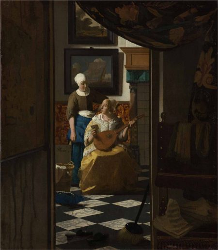
I think one of the appeals of 17th-century Dutch genre painting is that the narratives they present are familiar to us. Lutes may be in short supply today, but guitars and other stringed instruments abound. Women still fuss at their toilette. Today we read emails on our phones, instead of having the tactile experience of holding a sheet of paper. But human nature hasn’t changed that much.
The National Gallery of Art (NGA) has assembled what may be the definitive exhibition of 17th-century Dutch high-life genre painting, which focuses on the daily lives of the elite. Among the 65 paintings are 10 by Johannes Vermeer, nearly a third of the 34 works attributed to him. The curators of this exhibition– Arthur K. Wheelock, Jr., curator of northern baroque paintings, National Gallery of Arts; Adriaan Walboer, head of collections and research, National Gallery of Ireland, Dublin, who proposed the current exhibition; and Blaise Ducos, curator of Dutch and Flemish paintings, Musée du Louvre, Paris–deserve high praise for accomplishing that, but by including works by 14 of Vermeer’s contemporaries 1, they’ve given us a framework by which to judge the master.
Today Vermeer is acknowledged as the star of Dutch genre painting of the mid-1600s, but he did not hold that position at that time. He was successful enough as a provincial genre painter in Delft, but he was not widely known. Perhaps that was because a local collector, Pieter van Ruijven, purchased much of his work, and Vermeer was notoriously slow as he pursued a quest for precision, producing only about three paintings per year on order.
Following his death in 1675, his reputation was not enhanced when he was nearly ignored by Arnold Houbraken in the second volume of his three seminal books on 17th-century Dutch artists, Grand Theatre of Dutch Painters and Women Artists, published in 1719. Vermeer was rediscovered in the 19th century by Gustav Friedrich Waagen and Théophile Thoré-Bürger, and is now considered one of the greatest painters of the Dutch Golden Age.
I think there are several reasons for Vermeer’s popularity today. A viewer, no matter how unfamiliar he may be with this period of Dutch art, can pick out the Vermeer in the gallery at 20 paces. What makes his work stand out from his compatriots who were painting the same themes and often using nearly identical compositions is, first, a question of light. Vermeer’s paintings are suffused with a soft natural light, often from a window on the left side of the canvas, and this softens the painting overall.
His competitors’ work is crisper, close to photo-realism.
While Vermeer was skilled in depicting reality, his rivals, to a man, surpassed him in sheer virtuosity in recording the sheen of satin, the sensuousness of velvet, the folds of drapery, and every other thing in their scenes.
Vermeer’s harmonious compositions are quite abstract despite their realism. One can reduce the elements in a Vermeer painting to basic geometric shapes: triangles and rectangular elements that are natural to include, such as paintings within paintings, windows, doors, tables, chairs, and the ubiquitous diamond-shaped black-and-white marble floor tiles that lead the viewer into the scene.
There is a contemplative quality to all of Vermeer’s work that eludes the other 17th-century masters, even when they are recording a quiet moment. These artists capture a moment in time, while Vermeer’s works are time less.
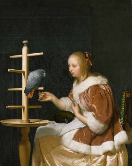
The exhibition is arranged around themes and subjects common to high-life genre painting, including Love and Courtship, Musicians, World of Men, and Parrots, a popular subject during the 1660s when they exemplified affluence. Technique and composition, such Back to the Viewer and Reflections, were other organizing principles for the exhibition.
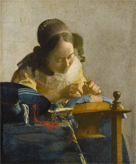
The first gallery, with two renditions of women making lace—one by Vermeer and the other by Nicolaes Maes–sets up the premise of the exhibition: to explore how these 15 artists inspired each other and sometimes were rivals. The exhibition allows us to situate Vermeer among his contemporaries.
In The Lacemaker, c. 1670-71, Vermeer drills in on the lacemaker who was probably a daughter of a well-to-do family as lacemaking was considered a worthy skill for accomplished young ladies. She is completely engrossed in the intricate and surely tedious process of making lace. The task is intricate and demands attention so the girl has shut everything out, which Vermeer communicates by focusing on her not her surroundings. For Vermeer, she is the personification of “virtuous industriousness.”
Maes’s Young Woman Making Lace, painted in 1655, is completely different. The lacemaker occupies the center of the composition but she is a small part of it as the artist shows us the room she’s working in. He has given us visual clues about her personality, as there is a portrait of Martin Luther and a moneybag hanging on the wall and an open book on the desk. These were meant to symbolize her industriousness, frugality, and domesticity.
The details are well defined in the Maes as he’s taken a very straightforward approach stylistically and given us an informative depiction. Vermeer’s details are looser; a tangle of sewing red and white thread is almost abstract. But I think you come away with a much fuller picture of the lacemaker in Vermeer’s picture.
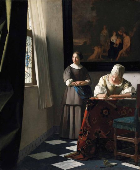
I’m sure someone could compile, or maybe has, a compendium of compositions used by these Golden Age artists. Vermeer’s Woman Writing a Letter with Her Maid, c. 1664-1666, and Gabriel Metsu’s Man Writing Letter, painted around the same time, are certainly siblings, if not twins, compositionally.
In both, the letter writers are seated at tables covered with a heavy tapestry. She faces forward and is intent on writing; he faces to the left and is seen in profile with his visage fully lit. Each sitter can be reduced to a triangle. The maid attending the woman has enough substance with her double skirts to appear conical. In the Metsu the way the table covering is arranged at the corner also makes a cone shape.
Other similarities include the fact that both figures are lit by light from a leaded window on the left, the black-and-white marble floors are identical, and paintings are hung on the greige walls behind them.
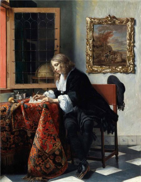
But there are marked differences, starting with the painting within the painting. The gentleman’s appears to be a pastoral scene, and in the lady’s room, the painting’s subject is unclear to me but I’ll guess, because of the nudes, it’s mythological. Metsu’s is presented in gilt baroque-style frame while Vermeer’s is framed in the simple style popular at the time.
The contrast between the frames actually describes the differences between the two paintings. Vermeer’s has a somber quality, soft light, and subdued palette. It’s all stillness.
Metsu’s is much more active. There is more light, the man twists to write on the table, the tapestry is bunched, his hat hangs on the chair as if he’s just come in, and even his curls seem unruly. The man’s sleeves and collar have more energy than those of Vermeer’s ladies. The painting suggests travel, and the globe seen through the opened window reinforces that.
Woman Writing a Letter with Her Maid has several of what might be called Vermeer-ian conventions. The light filters in through a leaded-glass window on the left. The palette is neutral except for the turquoise seat of the chair and stronger touches of the color in the scarf the maid holds. (Vermeer was known for using the expensive pigment lapis lazuli.) On the floor is a crumpled letter with a broken wax seal. The implication is that it has angered her, but her expression is still placid as she writes her response.
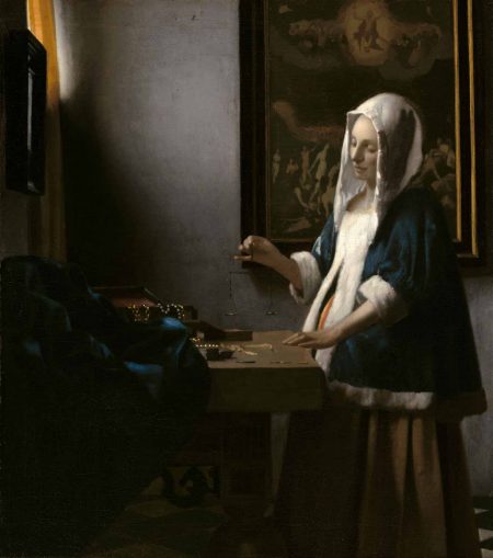
Whoever designed the installation saved—what I consider—the best to last. There are two paintings that are practically twins: Vermeer’s Woman Holding a Balance, c. 1664, and de Hooch’s Woman Weighing of the same year.
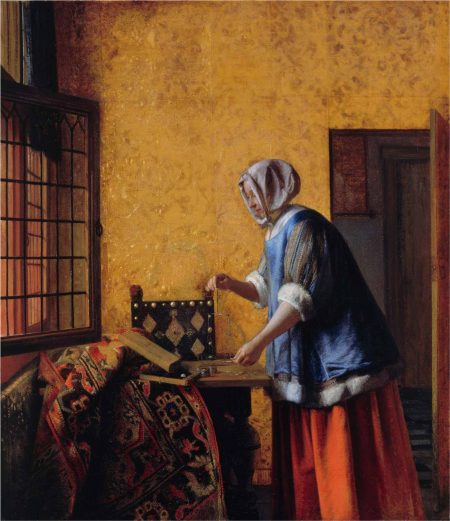
Everything about the two paintings is the same, except it’s not, and what’s not is what makes Vermeer great.
The compositions are virtually identical. Both paintings are lit by a window on the left, and the women are shown in profile. Over plain wood tables, which are partially covered by a tapestry in the de Hooch and a blue drape that appears to have no pattern in Vermeer’s, they hold nearly invisible scales in their right hands. In both works there are strong rectangular shapes in the background, a painting in Vermeer’s case and, in the de Hooch, a door leading to a corridor, which is just barely discernible.
But as Vermeer did in The Lacemaker, he has come in closer to the subject, and very little is happening in the picture to distract from the intimate scene. De Hooch, like Maes, has opened up the composition to place his woman in a room where she is merely another element, and, thus, is not as prominent as Vermeer’s lady.
There are other subtle, and not so subtle, differences. Although the light is from the same source in both paintings, it’s weak in the Vermeer and much of the scene is in shadow. It primarily illuminates the woman’s face and torso, drawing attention to her. This is reinforced by her white head covering and the fur trim on her luxurious midnight blue morning coat. On table you can just see a jewel box with pearls, symbols of purity and faith. Vermeer’s palette is subdued, with his colors having nearly the same values.
In De Hooch’s depiction, the light is brighter and more even, and he has pulled out all the stops with his vibrant orange wall; its boldness reminded me of another Dutch painter—Vincent van Gogh.
Despite their formal similarities, the De Hooch is a scene from daily life–the housewife is weighing gold coins to determine the status of the household finances while Vermeer’s painting could be an allegory on morality. His lady is waiting for the scales to balance. The act of weighing is one of judging, which is emphasized by the painting of the Last Judgment in the background framing her. Her tranquil attitude is in keeping with one who would live her life with temperance and balance.
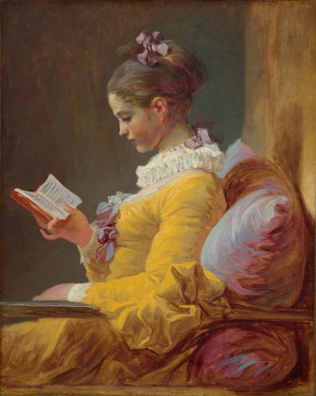
After the substantial meal that is “Vermeer and the Masters of Genre Painting,” slip across the hall to see “Fragonard: The Fantasy Figures” for a frothy dessert. Check out Young Girl Reading, c. 1769, a subject that would have appealed to all those Dutch dudes. In fact, the pose could have been borrowed from Gerard ter Borch’s Woman Writing a Letter, c. 1655-1656.
The fabric of Fragonard’s lady’s dress and the bolsters are as sumptuous as any of the Dutch painters but there’s a verve to the energetic brushstrokes unlike the invisible brushwork of the Dutch fijnschilder painters.
I don’t think I’m exaggerating to say that the Vermeer show is a chance of a lifetime, a must see. And with one-way fares from Allegiant Air less than $40, there’s no reason to miss it.
–Karen S. Chambers
“Vermeer and the Masters of Genre Painting: Inspiration and Rivalry,” National Gallery of Art, National Mall between Third and Ninth Streets at Constitution Ave. NW, Washington, DC 20560. 202-737-4215, nga.org. Mon.-Sat. 10 am-5 pm. Sun. 11 am-6 pm. Through Jan. 18, 2018. Free.
“Fragonard: The Fantasy Figures,” through Dec. 3, 2017.
ENDNOTES
1 Cornelis Bega, Quiringh van Brekelenkam, Gerard ter Borch, Gerrit Dou, Pieter de Hooch, Samuel van Hoogstraten/Cornelis Bisschop, Gabriel Metsu, Eglon van der Neer, Jacob van Ochtervelt, Nicolaes Maes, Frans van Mieris, Caspar Netscher, Johannes de Ram, Jan Steen, and Hendrick Martensz Sorgh.
2 The compositions are nearly identical. He painted in the front room on the second floor in his mother-in-law’s house in Delft, where he and a growing family (he fathered 15 children) lived. An inventory of his studio at the time of his death in December 1675 included two chairs, two easels, a desk, an oak pull table, “rummage not worthy of being itemized,” and 10 canvases. Many of his paintings are set in this room.